 Construction
 Agora Construction: Construction Brand Identity
10 min read
A structural brand for a Vancouver Island contractor specializing in outdoor living spaces. From hand-drawn joinery sketches to a cedar-and-brown A-frame built to live on trucks, hoodies, and business cards from day one.
The Brief
Keith Grant was launching Agora Construction on Vancouver Island — a residential outdoor-living-spaces specialty covering decks, pergolas, gazebos, fencing, landscaping, and remodels. The kind of work that puts a contractor’s brand onto a truck, a jobsite fence, and a client’s front yard every week of the season.
He came in with ideas. Not fully formed, but more than a blank page. He had a name with a meaning behind it — agora, the Greek word for a gathering place, the open community space historically centered on a structure at its heart. He had rough sketches torn from a notebook. And he had an instinct that the brand should feel structural: solid, built, visibly the work of someone who puts things together for a living.
The brief wasn’t to start from zero. It was to take what Keith brought, sharpen it, test it against real applications, and hand him back an identity ready to land on a truck door the day he launched.
Starting From the Shop Floor
The project started where a contractor’s ideas usually start: on paper, in pen, not in software.
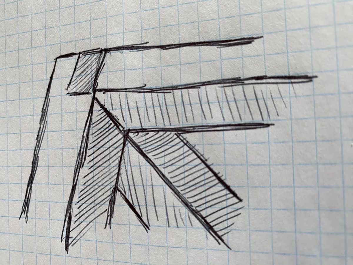
The first sketch was a corner joint in perspective — a mortise-and-tenon construction drawing with the beam passing through, cross-hatched to indicate the grain. It’s the kind of detail a carpenter draws without thinking, the way a mechanic draws a gear. Keith was drawing what he saw every day on a job. The sketch said the brand should look like the work.
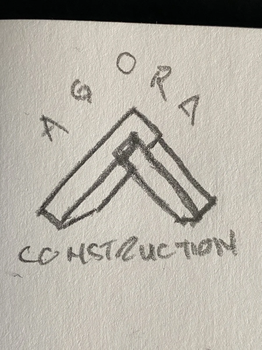
The second sketch leapt ahead to the full lockup. AGORA arched over the top, an A-frame peak in the middle drawn as two interlocking beams meeting at an apex, CONSTRUCTION straight across the base. Most of the final logo was in it already — the structural mark, the curved wordmark, the vertical stacking. The polished version would refine every proportion, but the skeleton was on the page.
Both sketches pointed at a project that wasn’t going to start from a moodboard. It was going to start from Keith’s hand and work outward.
Two Directions
Two distinct concepts came out of the exploration phase. Each pushed the brief a different way.
The first was A-frame — a monumental triangular peak built from interlocking beams rendered in 3D perspective. The letter A and the structure become the same shape. No house icon parked next to the wordmark; the wordmark is the structure. Heavy. Load-bearing. The kind of mark that could go five feet tall on the side of a jobsite trailer.
The second was Joinery — a circular badge with a 3D mortise-and-tenon corner detail inside, rendered in a warm sunset gradient of cedar-brown-orange-yellow. AGORA CONSTRUCTION wrapped the badge. More decorative than the A-frame, more craft-focused, closer in spirit to Keith’s original sketches. Where A-frame said we build buildings, Joinery said we build them well.
Both were presented in full context — on an F-250 door, on a trucker hat, on a dark hoodie, and as an Instagram profile — so Keith could see the brand live on the exact surfaces his business would live on from day one.
The Direction Keith Chose
A-frame won, and the name did most of the deciding.
Agora means gathering place — the Greek word for the open public square at the heart of a town, historically centered on a single defining structure. The word itself is about a building as a landmark. The A-frame made that meaning visible: the structure is the centerpiece, and the letter A is the structure. One shape doing two jobs, with the name’s etymology locked in behind it.
The Joinery direction had its own strengths — craft, warmth, a real connection to the sketches — but it read as decorative rather than structural. For a contractor whose trucks and crew hoodies needed a mark that commanded attention from across a parking lot, the A-frame’s gravity won out.
Inside the Mark
![]()
The mark reads as a single shape first and a construction drawing second.
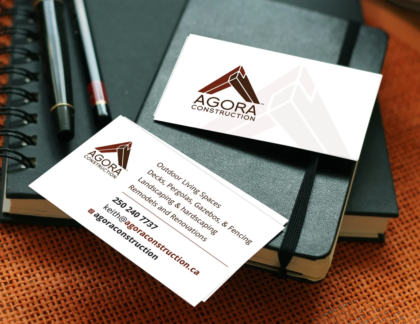
Two beams make the A. A cedar-red beam descends from the upper-left; a dark brown beam descends from the upper-right. They meet at the apex and cross each other the way a ridge beam crosses a rafter on a real roof — one beam in front, one behind, each beveled at the meeting point. Thin white lines separate the planes and reinforce the 3D reading, so the mark never collapses into a flat silhouette.
A small notch sits at the top of the right beam where it meets the ridge — a deliberate detail that suggests a miter cut or a joint seam. It’s the kind of detail a carpenter notices and a casual viewer doesn’t. Catch it and the mark goes from graphic to technical drawing. Miss it and the mark still works.
AGORA is set beneath the structural mark in a heavy geometric sans, all caps, in the same dark brown as the mark’s primary beam. CONSTRUCTION sits at the base in a smaller, lighter weight of the same typeface, giving the lockup its rhythm: mark, name, descriptor, stacked with confident vertical alignment.
Testing the Palette
Before the colour decision was locked in, four palette tests were worked up on a white F-250 pickup — the surface the brand was going to live on longer and more publicly than any other.
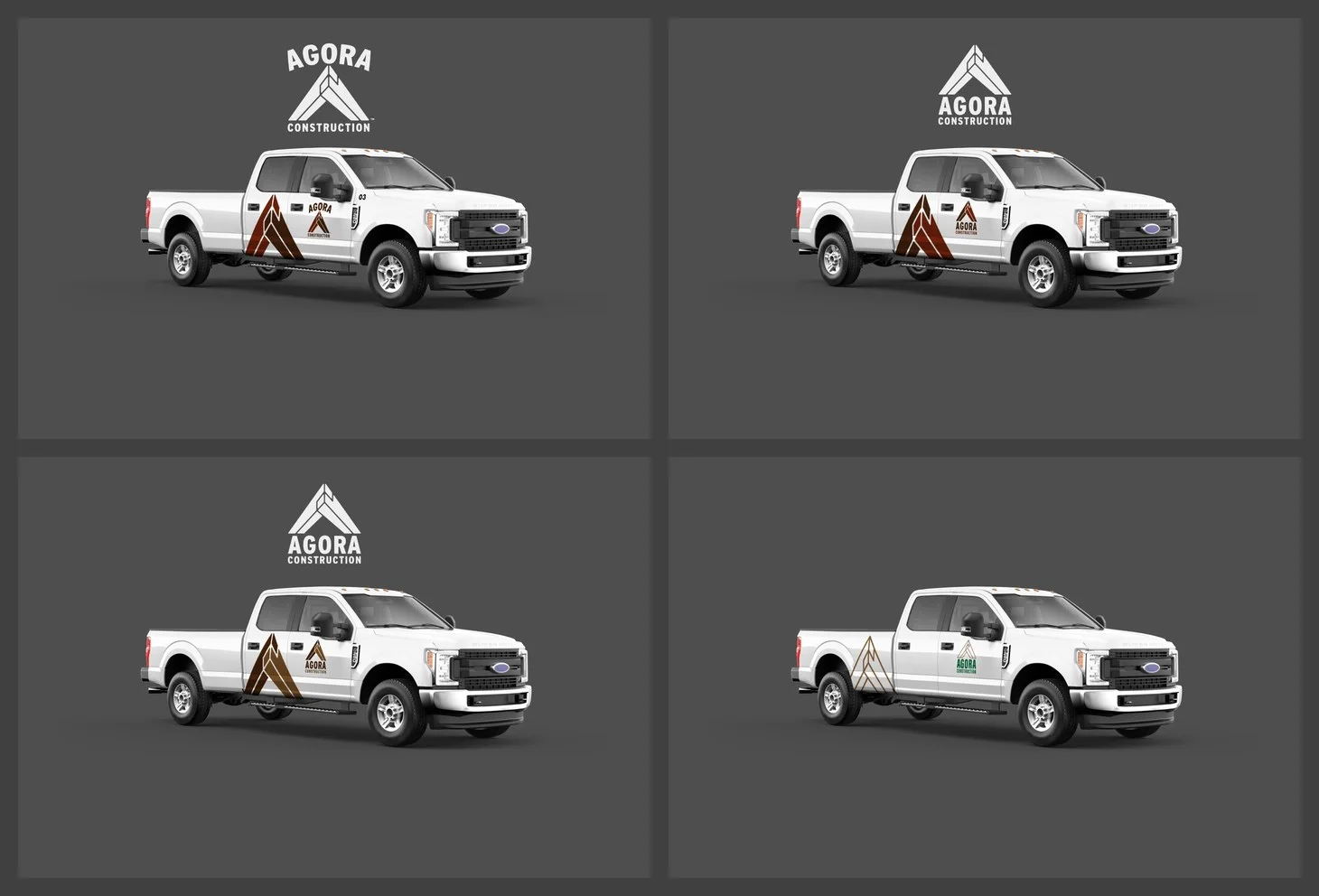
Top cedar and brown put the cedar red only at the apex of the A-frame, with dark brown carrying the descending beams beneath. Restrained. The red reads as an accent, not a shout. The version that ultimately won.
Filled cedar and brown took the same palette and pushed it further — cedar red filling an entire descending beam, dark brown filling the other. More graphic, more assertive, but the balance tipped toward red being the primary colour rather than the accent. On a truck door it read closer to a hardware-store promotional logo than a premium trades mark.
Two browns pulled the red out entirely and leaned on a warm tan-and-chocolate palette. Softer. More craft-store. It lost the sharpness that makes the mark recognizable at speed on a parking lot.
Thin lines, green and brown stripped the mark back to a line-only drawing with a green accent. The most minimal of the four, closest to a draftsman’s construction drawing. Clean, but on a white truck door at any distance the outline-only approach disappeared.
The comparison was the deciding tool. With all four on the same vehicle, at the same scale, under the same lighting, the choice became obvious: top cedar and brown held its visual weight at distance without overcommitting to red, and the accent placement at the peak reinforced the A-frame reading rather than flattening it.
From Arched to Straight
One more refinement landed between the initial direction and the final delivery.
Keith’s original sketches — and the first polished version of the A-frame mark — had AGORA set in a subtle arc above the structure. A hint of heraldry, a nod to old-world signage. It looked good at poster scale but started to wobble when the mark shrunk.
The final lockup straightened the wordmark beneath the mark on a clean horizontal baseline. Less decorative, more confident, legible at any size. A hat embroidery where the chest patch is the size of a palm lost nothing. A favicon held its shape. The change was small in proportion but big in performance: the brand stopped being nostalgic structural and became contemporary structural.
Across Every Surface
The mark was built to move, and the application set was drawn up for exactly that.
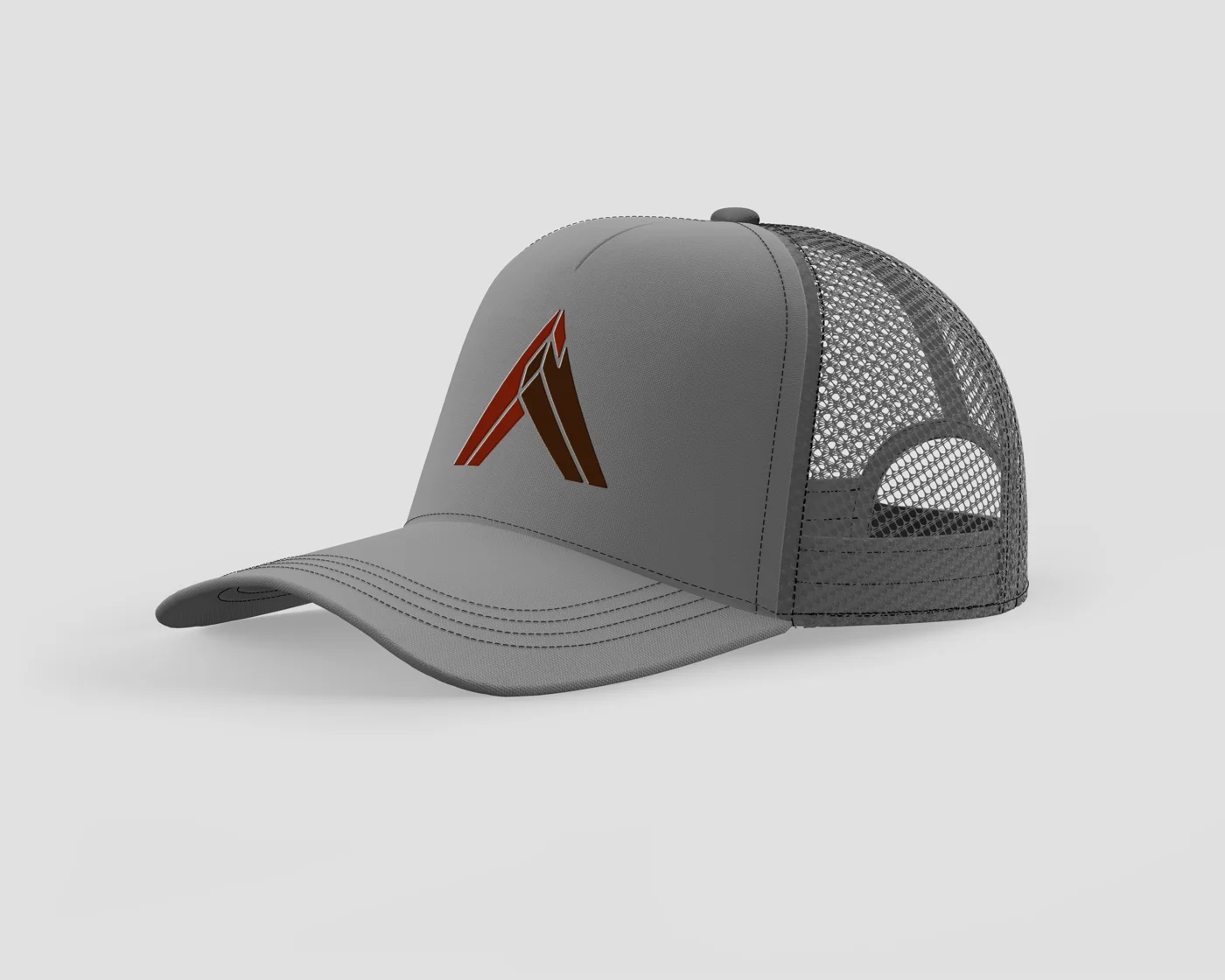
On a grey trucker hat, the full-colour mark sits centred on the front panel. Crew gear that reads as crew gear — not a corporate uniform, not a promotional giveaway.
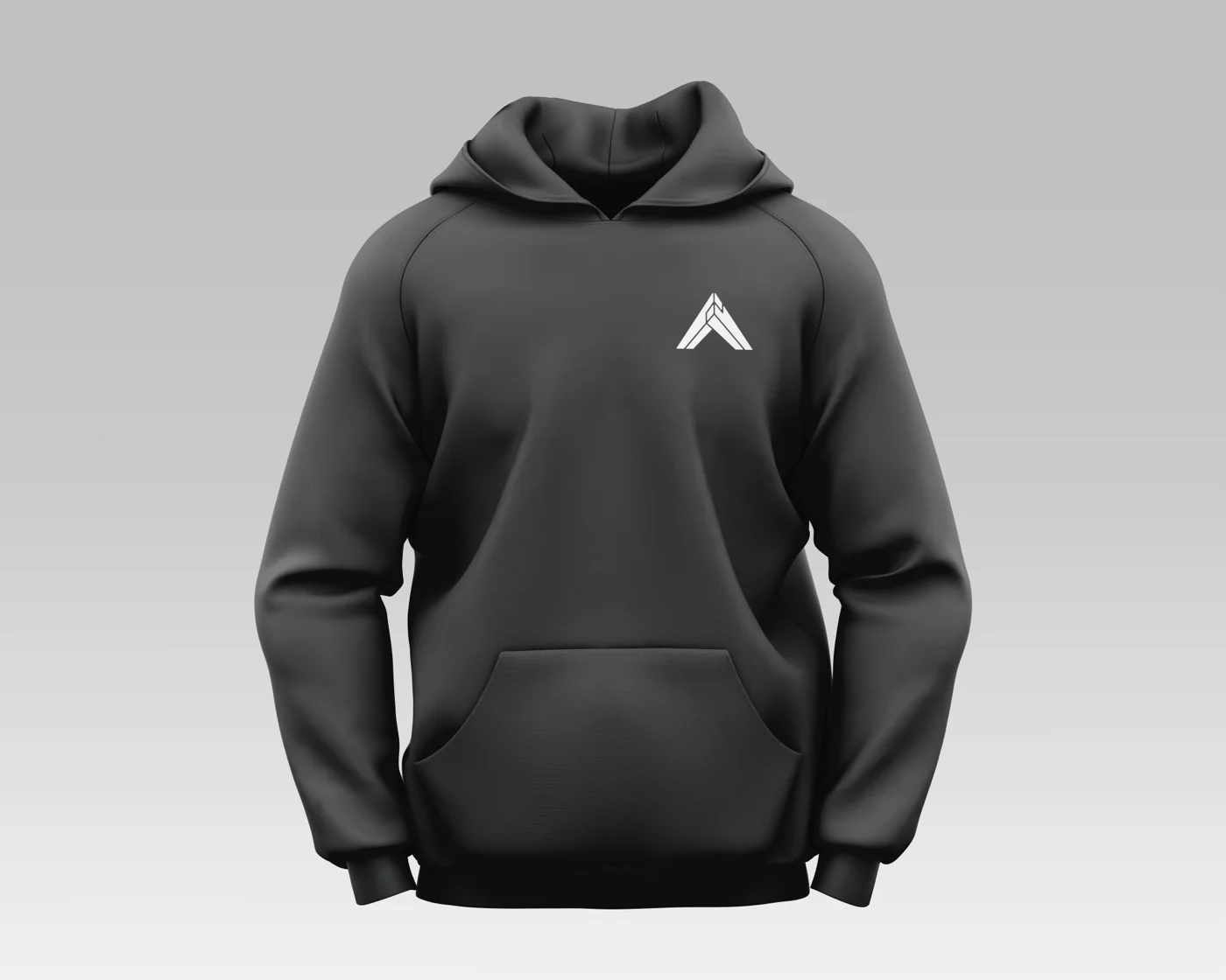
On a dark grey hoodie, the mark reverses to white on a single-colour chest application. The structural reading holds even without the two-colour treatment — the beam crossings and the apex notch carry enough information to read as the same brand.
On the business cards, the brand earns its first handshake. The front holds the full mark on a clean white ground with the A-frame ghosted at reduced opacity in the background — a quiet reinforcement, not a repetition. The back lists the services in a confident sans, with the mark small in the corner and contact details in cedar red.
The Result
Agora Construction launched with an identity that was already where it needed to be — on the truck door, on the crew hoodie, on the cards Keith handed to homeowners after walking the job. The A-frame mark reads as structure first and letter second, exactly the sequence a homeowner goes through when they see the truck pull up: what are those, then Agora. The cedar-and-brown palette gives the brand its grounded, built-from-materials feel without defaulting to the construction-industry blue-and-grey that every competing sign truck defaults to.
A trades business needs a brand that works as hard as the crew wearing it. This one does.
What Keith Said
“Sean was quick and professional. He worked with my existing ideas and improved upon them exceptionally well. The process was seamless and well communicated.”
Keith Grant, Agora Construction