 Community Event
 Coombs Fair: Community Event Brand Identity
10 min read
A heritage shield for a 1913 Vancouver Island fair, built to serve both the year-round fairgrounds facility and the annual summer event from a single mark.
The Brief
The Coombs Fairgrounds have been a gathering place on central Vancouver Island since 1913 — the home of the annual Coombs Fair and, across the other fifty weeks of the year, a rented venue for weddings, horse shows, markets, and community events of every stripe. Megan Pattison manages the grounds on behalf of the Arrowsmith Agricultural Association, and she needed a new identity that could handle both jobs at once.
The challenge wasn’t that the facility or the event lacked character. Both had more than a century of it. The challenge was that the old mark didn’t carry that character forward, and the organization couldn’t afford to run two separate brands just to serve two audiences.
One Brand, Two Jobs
Most rebrands are built for a single audience. This one had to serve two.
The year-round Coombs Fairgrounds audience is people renting the facility for their own purposes — showing horses, running markets, holding weddings in the main hall. They need signage that says this is a reputable place, open for business.
The seasonal Coombs Fair audience is families coming out for the August long-weekend event — livestock shows, agricultural exhibits, midway rides, cotton candy. They need a mark that reads as a fair you want to take the kids to.
Two different energies. Two different moments in the year. But the same site, the same heritage, the same association running both. The brand had to be one shield with two wordmark variants — COOMBS FAIRGROUNDS and COOMBS FAIR — so the year-round rental signage and the seasonal event banners could feel like the same organization without the reader having to stop and think about why.
Three Directions
Three concepts came out of the initial presentation, each solving the dual-audience brief differently.
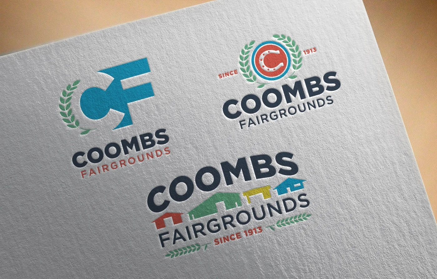
Positive-Space CF built an interlocking monogram: the letters C and F stacked so that the F’s horizontal arm cut across the C’s open mouth, with a green agricultural laurel wreath anchoring the left side. The most graphic of the three — fresh, typographic, modern.
Circle C went heritage. A circular shield with a navy outer ring, a red inner ground, and a white horseshoe set inside it where the letter C normally goes. The horseshoe’s open mouth forms the C; the dots along its inner edge echo the nail holes in a real shoe. SINCE 1913 split across the flanking laurels. The most traditional of the three, the one that felt like a county-fair seal rather than a corporate mark.
Facilities told the story of the site itself. A row of stylized fair buildings in the fairground’s actual paint colours — red, green, yellow, blue — tucked between the words COOMBS and FAIRGROUNDS, with wheat sprigs flanking SINCE 1913 beneath. The most literal of the three — the one that said this is where the fairgrounds live.
Each was worked up as both a Coombs Fairgrounds lockup and a Coombs Fair lockup, so the dual-variant system was visible in every direction from the beginning.
A Refinement Round
After the first presentation, all three directions went through a second round before the decision landed. The changes weren’t about reworking the shapes. They were about maturing them.
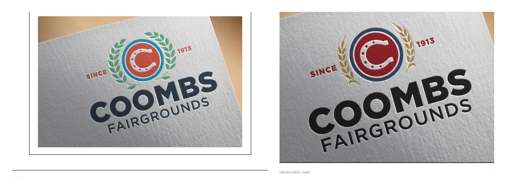
The first round leaned bright: a cerulean blue, a sage-green laurel, and a multi-colour wordmark in navy and red. It was friendly. It was festive. It was a fair.
The second round traded some of that friendliness for weight. The bright blue went deep navy. The green laurel became gold wheat — a specific agricultural symbol rather than a generic botanical one. The multi-colour wordmark consolidated into heavy black sans serif with horizontal rules bracketing the secondary word. The palette felt less like a party flyer and more like a fairgrounds that had been standing for a hundred and ten years.
The refinement is the version that reads as this place has history, and that’s the tone the project needed.
The Direction Chosen
![]()
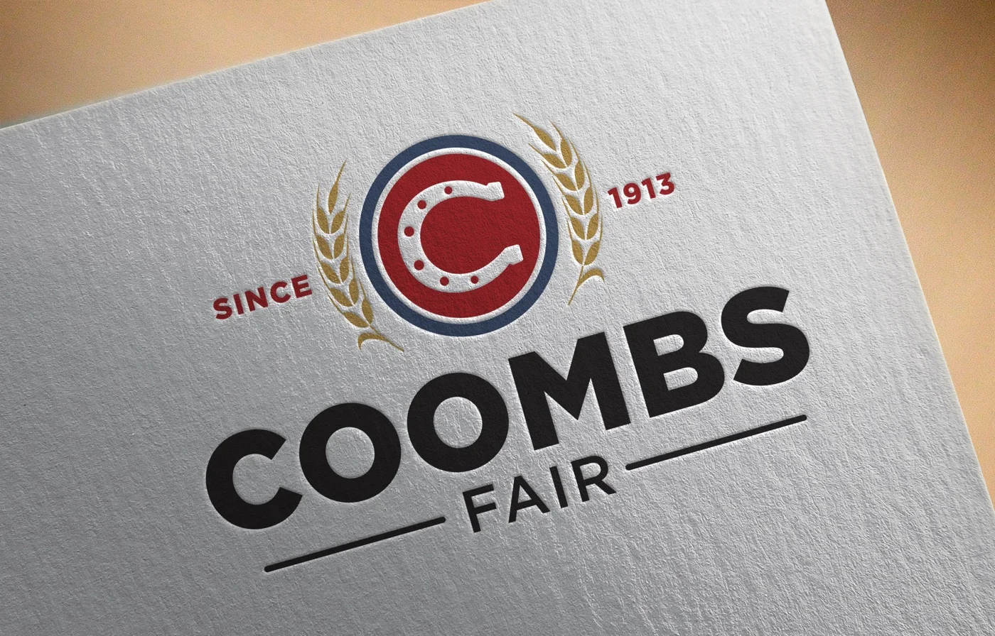
Circle C won.
The other two each did one job well. Positive-Space CF was the most contemporary, but its cleanness worked against the brief — a hundred-and-ten-year-old fair shouldn’t look like it launched last quarter. Facilities told the most specific story, but it told it too specifically; the colourful buildings read as illustration, and the mark lost some of the gravitas a rental facility needs on permanent signage.
Circle C did two jobs the others couldn’t. The horseshoe is simultaneously the letter C, an equestrian reference, and a folk-traditional good-luck emblem — three separate cultural readings resolving into one shape. And the circular shield format carries the architectural DNA of a real fair seal, the kind of emblem that already exists on century-old grandstand buildings. The mark didn’t have to pretend to be heritage. It actually was.
Inside the Mark
The construction is denser than a glance reveals.
The outer navy ring is a solid band, not an outline — a deliberate choice that gives the shield weight and makes it survive scaling down to a profile avatar or a small embroidered patch. Inside the ring, a red ground fills the disc. The navy-red boundary is what reads first from across a banner.
The white horseshoe sits centred on the red ground, opening downward. Its silhouette forms the counter of the letter C with no additional letter-drawing needed — the horseshoe is the C. Seven small red dots run along the inner edge of the horseshoe, spaced like the nail holes on a real shoe. They’re easy to miss at thumbnail size. At poster scale, they’re the detail that makes the mark feel observed rather than drawn.
Gold wheat stalks flank the shield on both sides, angled upward and outward so their tips align with the top of the ring. SINCE sits in red to the left of the shield; 1913 sits in red to the right, exactly mirroring it. The horizontal baseline of the text aligns with the horizontal diameter of the ring so the whole composition reads on a single invisible line.
The wordmark beneath is set in a heavy geometric sans, all caps, with COOMBS as the primary word and FAIR (or FAIRGROUNDS) as the descriptor beneath. Two short black horizontal rules bracket the secondary word — a detail that mimics the horizontal banding on old fair ribbons and gives the lockup its final bit of vintage weight.
The Dual Wordmark System
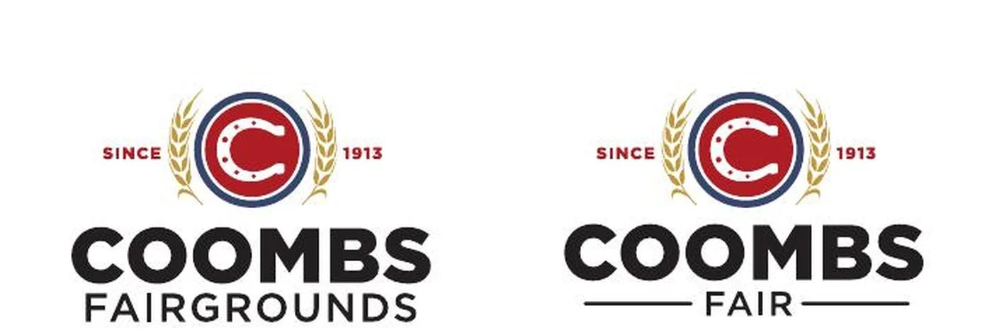
The shield above never changes. The wordmark beneath is the only thing that moves.
COOMBS FAIRGROUNDS carries the year-round facility branding. It goes on the permanent signs at the front gate, the rental contracts, the website headers, the invoices sent to wedding planners booking the main hall in March. The longer word gets the longer visual weight.
COOMBS FAIR carries the event branding. It goes on the summer posters, the program covers, the livestock-entry forms, the vendor applications. FAIR is bracketed by two short horizontal rules that give the shorter word the same visual width as FAIRGROUNDS above — so the two variants feel like they share the same horizontal footprint when they sit next to each other.
The result is a system that solves the original brief without compromise. The Arrowsmith Agricultural Association runs one brand. Its tenants see FAIRGROUNDS. Its audience sees FAIR. Both see the same shield — and the continuity between the two is what makes the whole thing feel like a single, well-run organization rather than two loosely-related entities sharing a site.
Navy, Red, Gold
The palette was chosen to do one specific thing: place the brand in the lineage of American and Canadian county-fair iconography without leaning into nostalgia as a style.
Navy does the structural work. It’s the colour of farm-show ribbons, county seals, and the canvas of a well-used fair banner. It signals heritage without aging the brand out.
Red is the accent. It’s the colour of a painted barn and the red-letter day a fair represents on a small town’s calendar. It’s warm, not alarming.
Gold does the agriculture. Wheat-stalk gold, not metallic. The gold of a late-August prairie crop, which is exactly what Coombs was built to celebrate.
Together, the three colours place the brand firmly in rural Vancouver Island tradition while sidestepping the bright-and-playful palette that most contemporary event branding defaults to. A fair built in 1913 shouldn’t try to look twenty-eight.
The Letterpress Test
Every concept was pressed into paper at the same time, at the same depth, on the same stock. Letterpress is an honest print method — the shapes that hold up under debossing are the shapes that hold up everywhere.
The three directions sat side by side on one sheet. Positive-Space CF held its geometry cleanly. Facilities lost some colour charm but held its composition. Circle C debossed with the kind of confidence that small rural-fair stationery has always had — the shield looked like it had been on a letterhead for decades before it was actually printed.
That was the moment the decision locked in.
The Result
Coombs Fairgrounds now has a brand that reads as old because it looks old — built from the same vocabulary of shields, horseshoes, wheat, and heritage palette that rural-Canadian fair branding has used for over a century. But it reads cleanly on a phone screen, holds its shape at favicon size, and debossed into paper with enough weight to sit confidently on a wedding-rental contract.
The dual-variant system means one shield serves both audiences: COOMBS FAIRGROUNDS for year-round rental and facility branding, COOMBS FAIR for the annual summer event. The Arrowsmith Agricultural Association runs one brand that solves two problems — which is the hardest brief a small organization can bring to a rebrand, and the one that pays off longest.