 Real Estate
 Schug Realty Group: Real Estate Brand Identity
8 min read
A typography-driven realtor identity built to coexist with the Royal LePage parent brand on every lawn sign, vehicle, and storefront in the Parksville-Qualicum corridor.
The Brief
Adam Schug is a realtor with Royal LePage in the Parksville-Qualicum Beach corridor, one of the most active real estate markets on Vancouver Island. He needed a brand identity that would hold its own on lawn signs, vehicle wraps, apparel, and digital platforms — and do all of that while sitting cleanly alongside the Royal LePage parent brand on every piece of marketing he produces.
In a market where most realtors default to a templated logo from their brokerage, Adam wanted something unmistakably his. Premium and trustworthy, but not generic. Recognizable from across a parking lot. Distinctive enough that a buyer who saw the sign once would remember it.
The Constraint That Shaped Everything
In real estate, the brand never lives alone. Every for-sale sign, every flyer, every business card carries the Royal LePage parent lockup — a bold red bar with the RLP wordmark and the regional brokerage line beneath it. That’s a non-negotiable feature of the marketing surface, not an afterthought to be designed around.
That constraint shaped the entire brief. Whatever the Schug mark became, it had to coexist with Royal LePage rather than compete with it. The two brands needed their own zones on a sign, their own visual jobs, their own slices of the eye’s attention. A logo that fought for the same shape vocabulary as RLP — heavy red rectangles, dominant icons — would lose. A logo that played a different game would win.
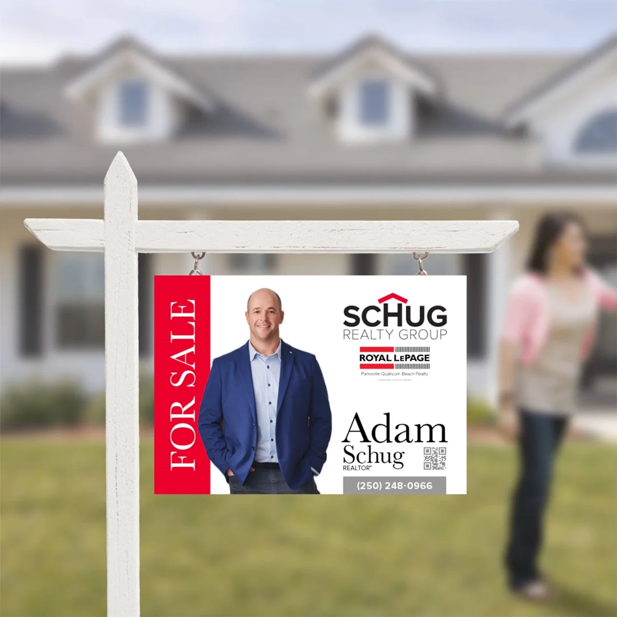
The lawn sign became the central test. If the mark worked there, with the for-sale block and the photo and the parent lockup and the contact details and the QR code, it would work anywhere.
The Directions Explored
Three distinct creative territories were developed in parallel, each taking a different angle on how to solve the brief and each tested against the same lawn sign layout so the choice could be made where the brand would actually live.
“Cozy H” put the work into the typography. A heavy black geometric sans wordmark where the H in SCHUG is set taller than its neighbours, with its central crossbar removed and a red chevron set above it. The H’s two verticals become the walls of a house; the chevron becomes the roof. The roofline lives inside the wordmark instead of next to it — no separate house icon, no cliché, just typography doing two jobs at once.
“Elegance” leaned into luxury. A high-contrast didone serif wordmark with a thin red roofline drawn beneath, “Realty Group” tucked under the descender of the g in a smaller serif. Editorial, premium, restrained — the brand for a realtor working the high end of the market.
“SRG” went dimensional. The R and G arranged as the two visible faces of an isometric cube, with a red S sitting on top like a roof, the whole monogram reading as both a 3D object and a stylized house. Modern and graphic, with a confident black-and-red palette.
Each was presented in full context — lawn sign, storefront window, vehicle, office wall, embroidered apparel — so Adam could see exactly how each direction would carry across the surfaces a realtor brand actually has to live on.
The Direction Adam Chose
![]()
Cozy H won on every test. The typography-first solution cleared the cliché the industry can’t seem to shake — the wordmark with a tiny generic house parked beside it — and replaced it with something more confident. The roofline is part of the H, not bolted on. You read the word first, the building second, and they’re the same shape.
It also reads at every scale. From a five-foot lawn sign to a 32-pixel browser favicon, the construction holds. The two-colour palette stays clean next to Royal LePage’s red without ever competing with it for the same eye space.
Inside the Mark
The construction rewards a close look.
SCHUG is set in a custom-tightened heavy geometric sans, with the H pushed taller than the surrounding letters so it can carry the roofline above it without disrupting the baseline. The H’s central crossbar is removed entirely — what would have been the bar becomes empty space beneath the chevron, the way the inside of a house is empty space beneath its roof.
The red chevron sits directly above the H’s two verticals, kissing their tops so the eye reads a single continuous form: walls, then roof. The angle of the chevron is shallow rather than steep — a gentle Vancouver Island roofline, not an alpine A-frame. Nothing about it shouts this is a house icon. It just is one.
REALTY GROUP runs underneath in a thin, letterspaced caps line. It’s the typographic counterweight to the heavy SCHUG above: light against heavy, wide against tight, restrained against bold. The two lines together give the lockup its rhythm — a confident headline on top, a measured supporting line beneath.
Built for the Co-brand
Where the mark earns its keep is on the lawn sign.
Schug is type-driven and vertical. Royal LePage is shape-driven and horizontal — a solid red bar with a wordmark inside it. The two never compete for the same job. SCHUG holds the top of the sign as the primary identity. The Royal LePage block sits beneath it as the credentialing layer. Adam’s name and contact details sit to the right. The for-sale flag runs down the left edge.
Five elements, each with its own zone, none of them stepping on the others. That’s the brief solved: a brand that works with the parent rather than around it, without ever feeling like a co-brand compromise.
A Standalone Icon
![]()
The full lockup needed a small-scale companion — a mark that could carry the brand in a favicon, a profile photo, a business card corner, an embroidered chest patch where the wordmark would lose all legibility.
The system was already there. The chevron + capital letter is the brand DNA. The wordmark version uses H. The icon version uses S — the first initial of the family name, the same heavy weight, the same red roofline. Same brand, different letter.
It means the brand can compress all the way down to a single character without ever losing what makes it recognizable. Wherever the wordmark won’t fit, the S goes instead — and it still reads as Schug.
Across Every Surface
The mark was built to move, and the applications were drawn up for exactly that.

On a glass storefront, the white knockout treatment lets the brand sit on the window without blocking the view through it.
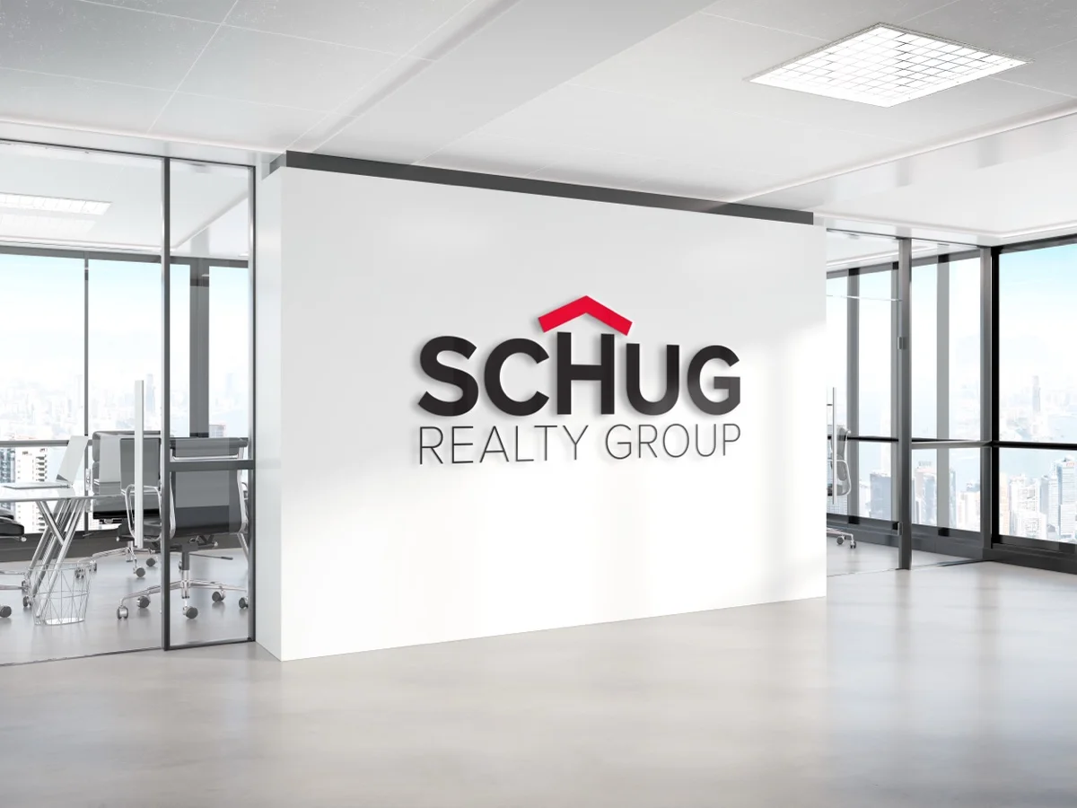
In the office, the full-colour lockup is built up as a dimensional wall sign — black letters with the red chevron in raised relief, lit by the boardroom’s natural light.

On the side of a vehicle, the lockup reads cleanly across a driveway or down a street — a moving billboard in a market where realtors are constantly on the road between showings.

Embroidered in red and black thread, the mark holds its weight even when texture and stitch get in the way of the geometry.
The Result
Schug Realty Group now has an identity that does what most realtor brands can’t: it’s instantly recognizable on its own and it sits cleanly alongside the Royal LePage parent without either brand losing its presence. The Cozy H mark reads as a wordmark first and a house second, sidestepping the templated icon-plus-name approach that saturates the industry.
The Cozy S icon gives Adam a small-scale companion for everywhere the full lockup won’t fit, so the brand can carry from a five-foot lawn sign down to a profile avatar without ever needing to be redrawn. And the two-colour palette — heavy black, signal red — works as hard on glass as it does on fabric, on glossy vehicle vinyl as it does on a printed business card.
It’s a brand built for visibility in a market where being remembered is half the job.
What Adam Said
“A huge thank you to Sean at Pacific Logo for his incredible work on designing the logo for Schug Realty Group! From start to finish, Sean went above and beyond, taking the time to sit down with us and really dive deep into understanding our vision.”
Adam Schug, Schug Realty Group