 Engineering
 Crowie Metallurgical Consulting: Engineering Brand Identity
10 min read
A brand identity for a metallurgical consultancy that puts the act of extraction itself into the mark. From hand-drawn sketches to gold-foil business cards on a wood round.
The Brief
Tad Crowie, P.Eng. runs a metallurgical consulting practice — a niche, technically-deep field where he advises mining and processing companies on how to get more from the ore they’re working with. The audience is unforgiving. Proposal covers land in front of mine general managers and process engineers who have seen every kind of consultancy pitch. Generic doesn’t survive that room.
He needed an identity that would carry the same authority he brings to a technical review meeting. Premium without being decorative. Specific to metallurgy without being literal about it. Confident enough to belong on a stack of bids next to the engineering majors.
The mark also had to live in print as much as on screen — proposal covers, technical reports, gold-foiled business cards exchanged across boardroom tables. So the construction had to be tight enough to survive small-scale debossing, scaled signage, and the kind of close inspection a process engineer is professionally incapable of resisting.
Starting With the Material
Before anything reached Illustrator, the work began in a sketchbook.
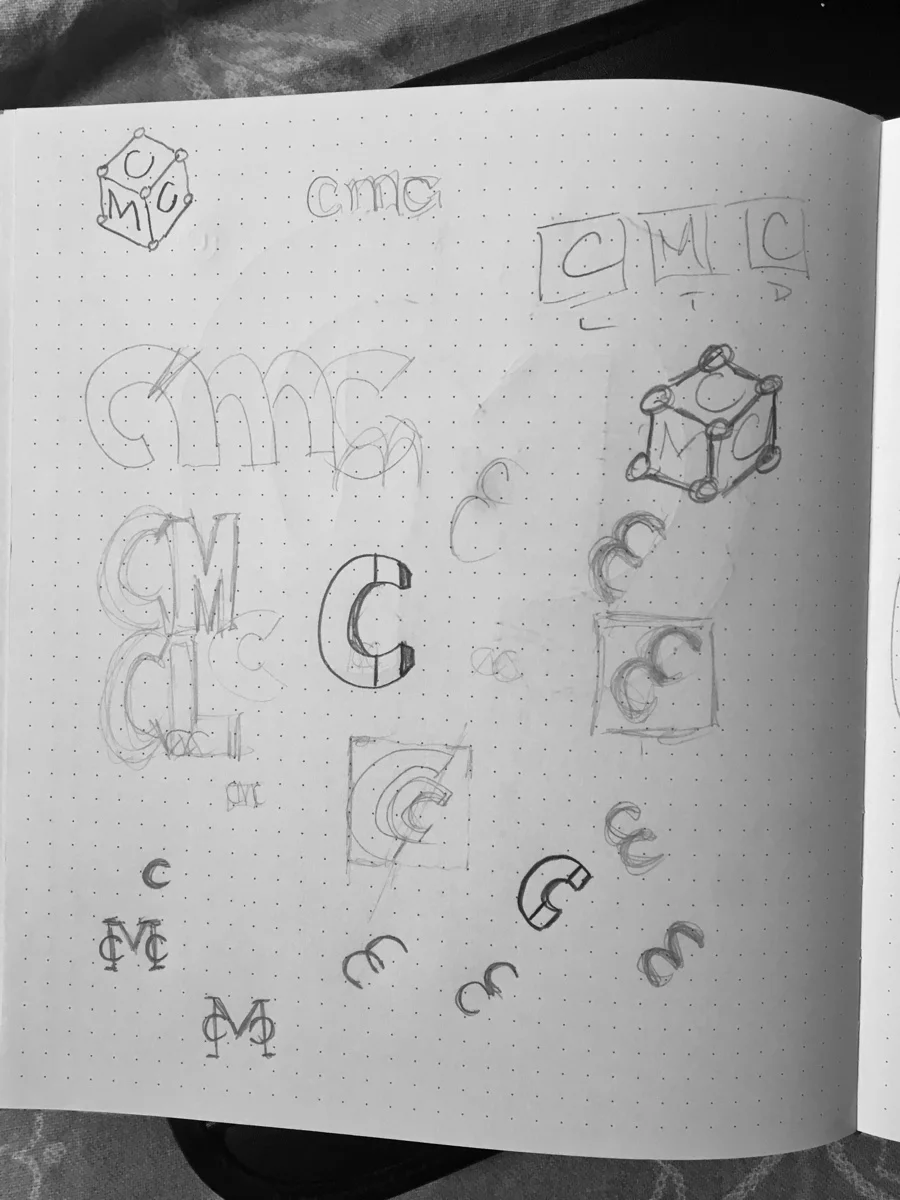
Pages of CMC monograms. Cube constructions where the three letters wrapped a 3D form. C-shapes broken in half and reassembled. Some leaned heritage — old assayer’s stamps, oval cartouches, the kind of mark you’d press into wax. Others leaned mechanical — gears, drill bits, sectional cuts through ore samples.
Most of them weren’t going to make it. That’s the point of sketching: a hundred bad ideas earn the right to a few good ones.
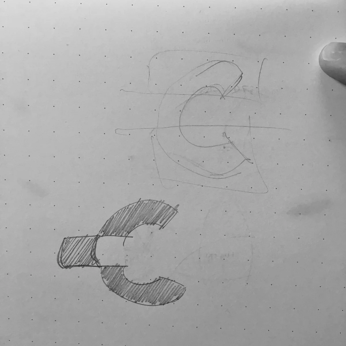
The breakthrough came when one rough thumbnail did something the others didn’t: it stopped trying to represent metallurgy and started being it. A solid block of source material with a smaller, refined element lifted clear of it. The mineral, mid-extraction. That sketch carried construction lines around it — the geometric grid the final mark would eventually sit on. Everything that became the EXTRACT direction starts here, on a dotted Moleskine page.
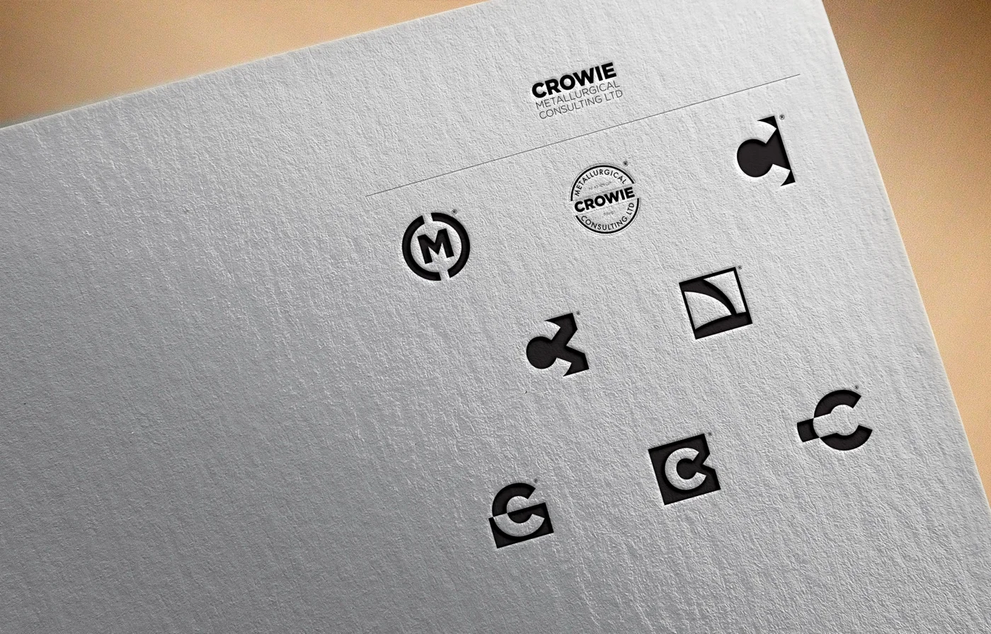
Three Directions
Three named concepts came out of the sketching, each pushing the brief in a different direction. They were developed in parallel and presented together so Tad could see them solve the same problem in three distinct ways.
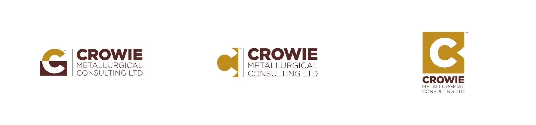
EXTRACT built the C in two halves stacked vertically. A gold arc sat on top — the precious portion, lifted clear. A deep brown rectangular block sat beneath, with a white C-shape carved out of its negative space. The horizontal seam between them was the line where ore meets refined product. The most narrative of the three.
REVEAL went the other way. Instead of building the C, it carved one out. A solid gold rectangle had two clean circular bites taken from its right edge, and the negative space between them formed the C. The mark you saw was what was left after extraction. The most graphic of the three.
NOTCH was the boldest. A solid gold square with a chunky, geometric white C cut straight through the middle. No metaphor about the process — just the letter, weighted like a foundry stamp, sitting above the wordmark in a vertical lockup. The most stamp-like, the most assertive, the easiest to imagine debossed into a steel plate.
Each was shown the same way: full colour, grayscale and reversed-out, applied to a stationery suite, debossed into letterpress paper, set on a dimensional storefront sign, and rendered on a phone screen. The same identity, the same weight of treatment, three answers to the same brief.
The Direction Tad Chose
![]()
EXTRACT won.
Of the three, it was the only one whose construction meant something to a metallurgist. REVEAL was elegant; NOTCH was strong; but EXTRACT looked like a cross-section of the work itself — the source material below, the refined product above, the line of separation between them. A process engineer reads that mark and recognizes what they do for a living.
It also happened to be the most flexible. The vertical split between gold and brown gave the mark an internal structure that scaled cleanly from a five-point favicon to a wall-mounted dimensional sign. Most monograms lose their geometry as they shrink. EXTRACT held its.
Inside the Mark
The construction is more deliberate than it looks.
The gold arc is a half-disc — exactly half of a perfect circle, rotated to sit flat against the top edge of the brown block beneath it. It’s positioned slightly off-centre to the right, mirroring the open mouth of the C below. That asymmetry is what gives the mark its sense of motion: the arc reads as having been lifted out rather than placed.
The brown block is a rectangle with a C-shaped void carved into it from the right side. The void’s curves match the radius of the gold arc above, so the two halves share a common geometry even as they sit visually apart. Run a vertical line down the centre of the mark and the arc above and the void below align on the same axis.
The whole composition is built on a Golden Ratio grid — the proportions of the brown block, the diameter of the gold arc, and the width of the negative-space C all follow the 1:1.618 relationship. It’s not the kind of detail a viewer consciously reads. It’s the kind of detail they feel in why the mark sits right in a way that something off-grid wouldn’t.
The wordmark to the right of the mark is set in a heavy geometric sans — CROWIE in a confident, slightly condensed weight, METALLURGICAL CONSULTING LTD beneath it in a lighter weight at smaller scale. A thin vertical brown rule separates the mark from the wordmark, giving the lockup a measured rhythm and a clear hierarchy: symbol, separator, name, descriptor.
Earth and Refined Metal
The colour palette was the easiest call in the project.
Deep brown does the structural work — the colour of source rock, of the matrix the work begins inside. It’s the dominant colour of the mark and the secondary colour of the wordmark. It carries the weight.
Gold does the accent work — a warm, muted ochre rather than a metallic shimmer, because the brand needed to read as serious rather than ornamental. It signals the precious end of the work without ever tipping into jewellery-store territory.
The two colours together avoided the engineering-industry defaults of safety blue, alarm red, and corporate silver. Brown and gold positioned the practice somewhere different: closer to a heritage assayer’s stamp than a modern engineering firm. That positioning was the point.
A Letterpress Test
After the formal presentation landed on EXTRACT, the work continued — into a phase the brief never asked for but the mark earned.
A series of variants got pressed into paper to see how the mark would survive the most punishing print method in the toolkit. Letterpress is a stress test: the mark either holds up under the impression or it doesn’t. There’s no Photoshop layer correcting for a thin stroke, no anti-aliasing softening a hard corner.
The chosen EXTRACT mark sat alongside experimental versions — alternate monogram constructions, a dimensional 3D treatment, a pour-shape variant — all pressed into the same paper at the same depth. With the variants together, it became impossible to mistake which one had been built for the press. The arc-and-block geometry held its edges. The negative-space C debossed cleanly. The lighter, more delicate variants didn’t.
That’s the value of the test. The chosen direction wasn’t just the right call on a screen. It was the right call in the medium the brand was actually going to live in.
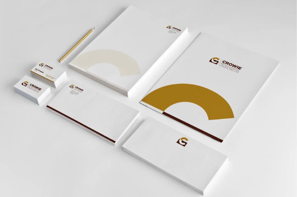
In Print, In Hand
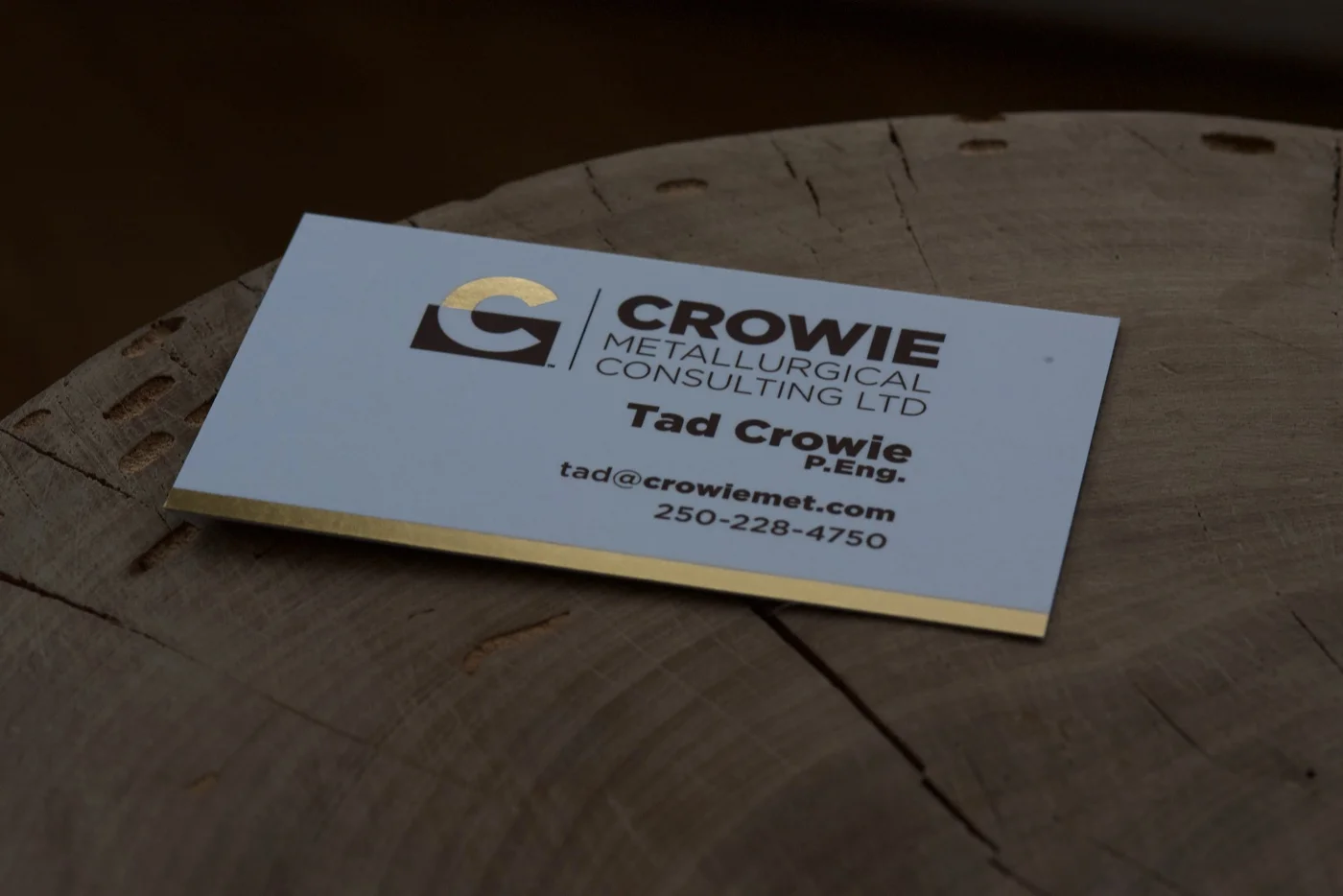
The brand’s first physical incarnation was a stack of gold-foil business cards.
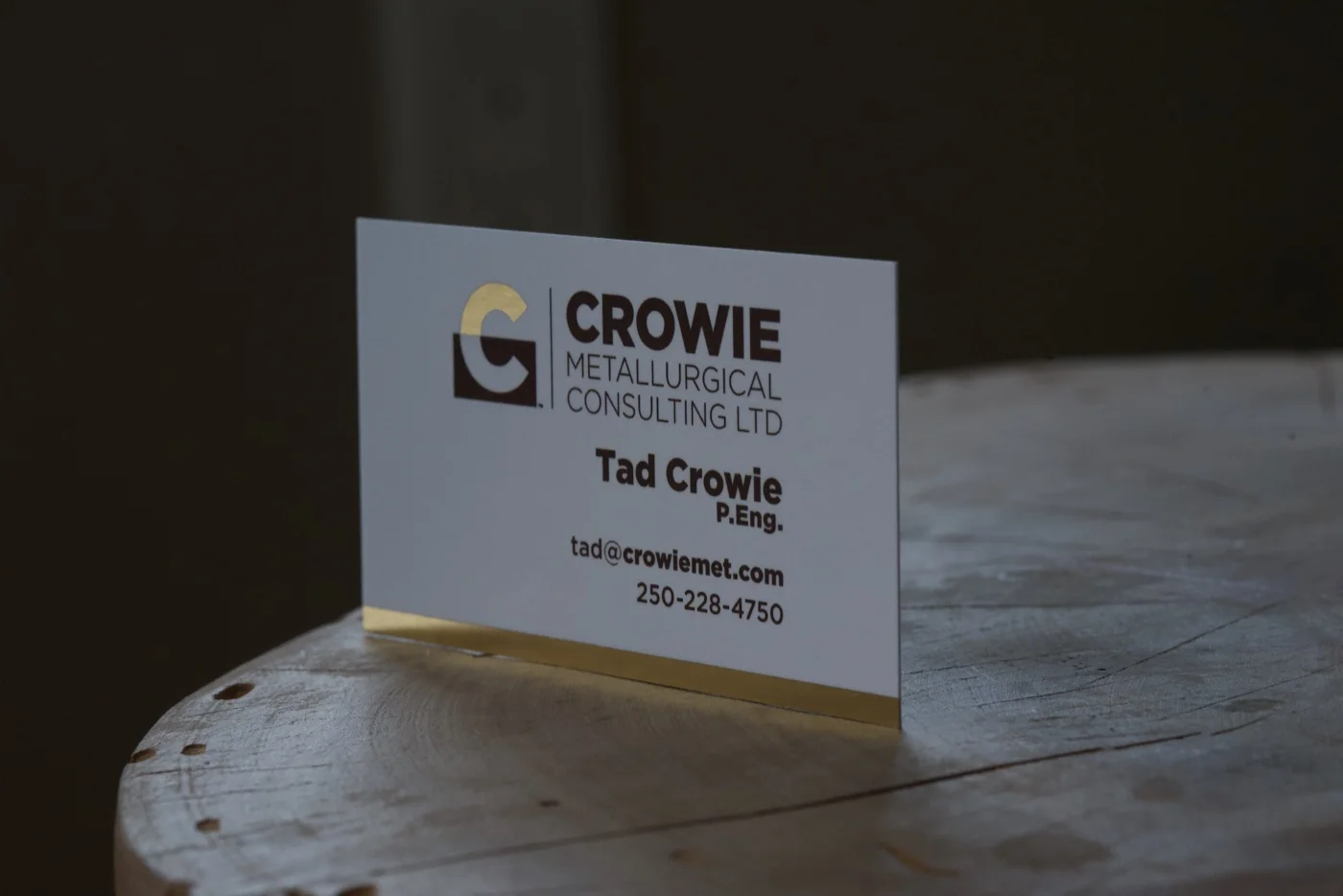
The C arc was rendered in actual gold foil — a pressed, reflective layer of metal applied over the brown block, so the mark on the card behaves the way the mark on the screen suggests: light catching the precious portion, the matrix beneath staying matte. The card edges were also gilt in gold, so the side profile of a stack reads as a thin gold band running through brown wood and white paper.
It’s a small object. The total surface is two by three and a half inches. But every detail of the brand is on it: the geometric construction of the mark, the brown-and-gold palette, the typographic hierarchy of the lockup, the credentials line beneath Tad’s name. Everything the system has to say, said at hand-size.
The Result
Crowie Metallurgical Consulting now has an identity that does the technical-authority work the brief asked for, and a few things it didn’t ask for too. The EXTRACT mark reads as a process diagram before it reads as a logo — exactly the right sequence for an audience that thinks in process diagrams. The brown-and-gold palette positions the practice as a heritage-quality consultancy in an industry full of safety-yellow defaults. And the geometry holds up under the worst that print can throw at it, because it was built for that test.
It’s a brand that earns its keep across the surfaces it actually has to live on: proposal covers, technical reports, debossed business cards, and the boardroom handshake at the start of a major engagement.
What Tad Said
“Sean Wood designed a logo for my company which captured the essence of my business. Sean is very creative and the logo looks great. There was good communication throughout the process from our initial meeting to the final issue of the logo.”
Tad Crowie, P.Eng., Crowie Metallurgical Consulting