 Agriculture & Packaging
 Promise Valley Farm & Creamery: Agriculture Brand & Packaging
6 min read
A complete brand identity and yogurt packaging system for an organic Guernsey dairy on Vancouver Island. From logo to grocery shelf.
The Brief
Caroline and Mark were launching Promise Valley Farm & Creamery, a small organic dairy on Vancouver Island built around a herd of Guernsey cows. They weren’t producing yogurt in a factory. They were milking their own cows, on their own land, and bottling what came out.
They needed a brand that reflected that. Something that felt like a real working farm rather than a marketing department’s idea of one. And then they needed packaging that could sit on a grocery shelf next to Oîkos, Liberté, and Astro and still feel like the one you wanted to pick up.
It became two projects in one: a logo identity, and later, a full packaging system for three flavours of yogurt.
Start With the Herd
Before anything else, the brand had to honour the cows.
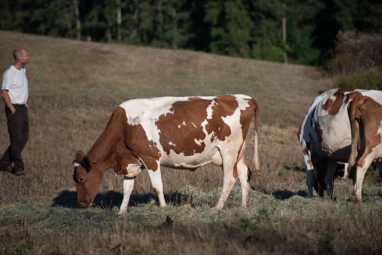
Promise Valley milks Guernseys, an older heritage breed known for the rich, golden-toned milk they produce and the distinctive red-and-white colouring that gives the farm its character. Guernsey milk is higher in butterfat, richer in beta-carotene, and carries the A2A2 protein profile that a growing segment of shoppers actively seeks out.
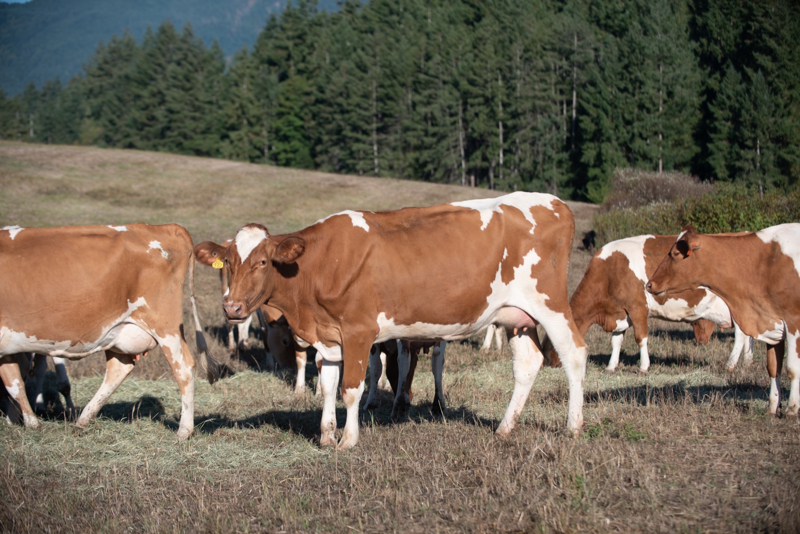
The breed matters. It shapes the product, the farm’s positioning, and ultimately the brand. So the logo needed to feature a cow — and not just any cow. The silhouette had to read as a Guernsey: the stance, the proportions, the presence.
The Logo
![]()
The final mark takes the shape of an old farmhouse plaque: an arched top, a solid border, and a balanced composition inside. It’s the kind of sign you’d expect to see nailed to a barn door, weathered by West Coast rain.
Inside the plaque, the cow stands on a patch of grass, anchoring the composition. Promise Valley arcs across the top in a classic serif. Farm & Creamery sits at the base in a confident horizontal lockup. Est. 2021 flanks the cow on either side.
Early concepts explored a fully enclosed circular badge, but the arch shape won out for its combination of heritage feel, shelf presence, and legibility at small sizes. Every element was chosen to feel established rather than new.
Two Variants, One System
As the farm pursued A2A2 Organic certification, the brand needed to accommodate a second lockup — same mark, same silhouette, different inside text.
![]()
The Est. 2021 detail becomes A2A2 Organic, signalling the certification directly on the packaging where it matters most. Same plaque shape, same cow, same confidence. The variant system lets the brand flex between heritage storytelling and functional certification language without ever feeling like a different company.
Phase Two: Onto the Shelf
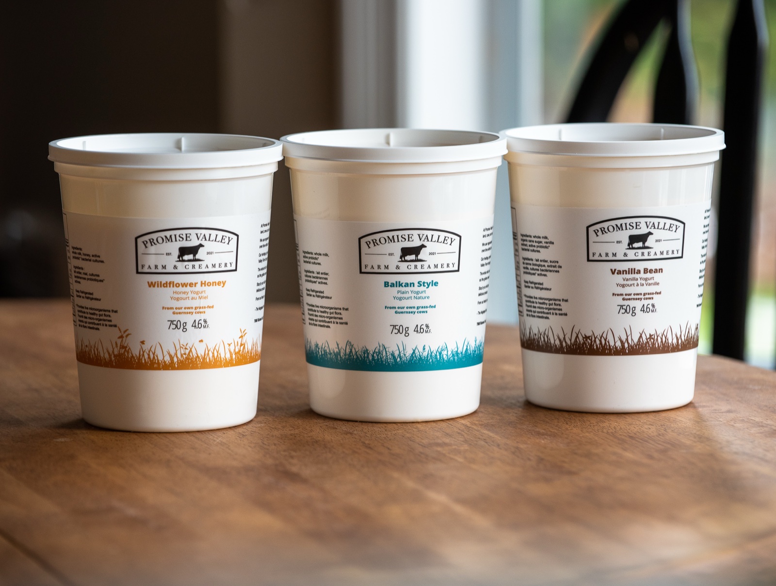
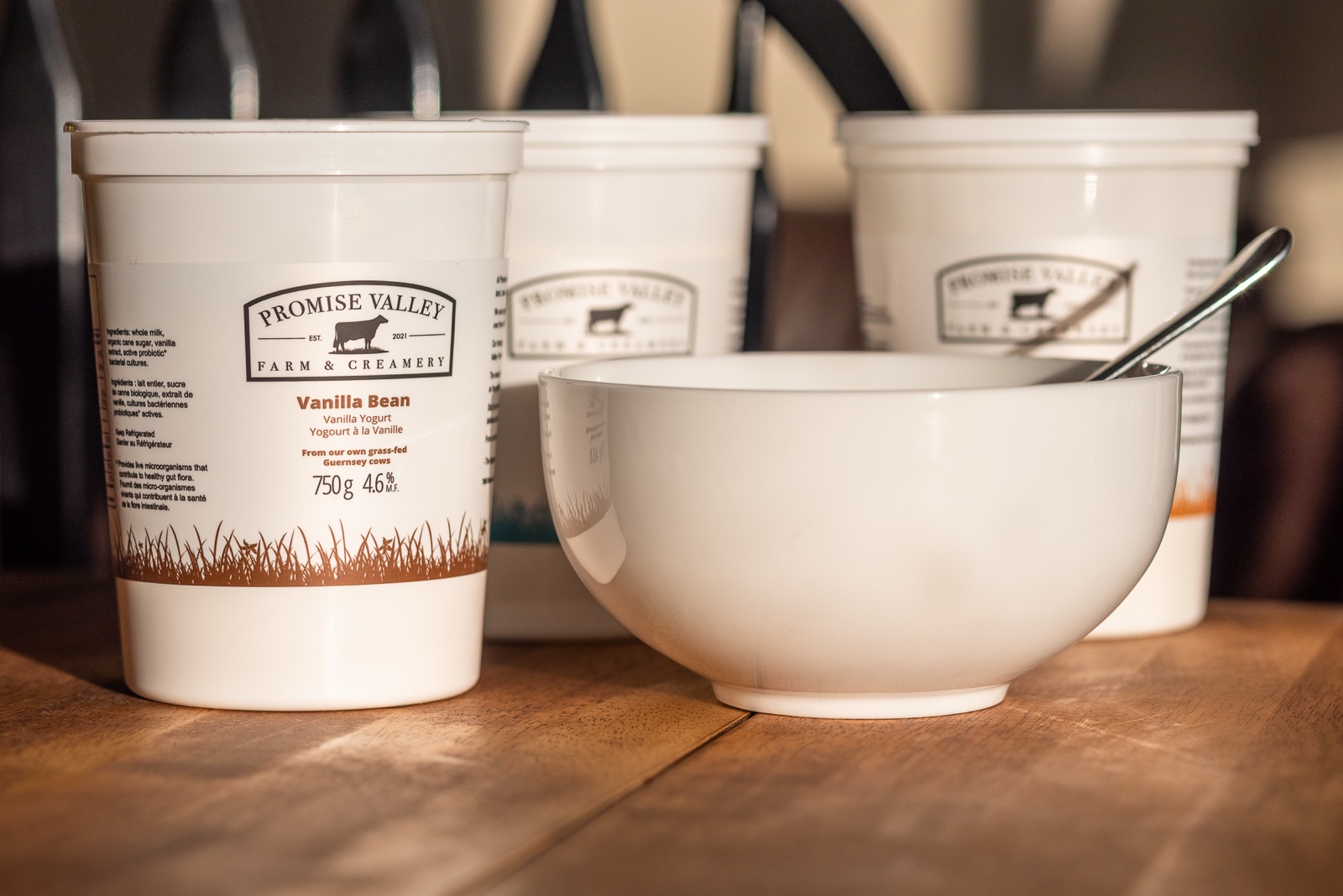
Once the logo was settled, the harder project began: designing packaging for a three-flavour yogurt line that had to compete with national brands at the dairy cooler.
Three flavours. One family. A system that had to stay cohesive across the lineup while making each variant immediately distinguishable at arm’s length.
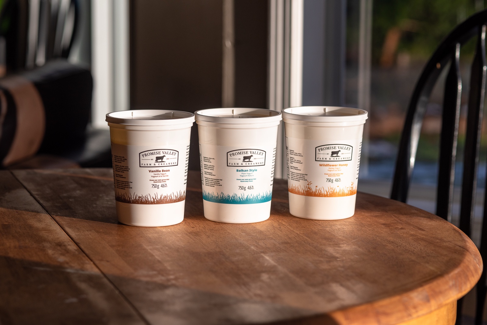
The structural decision: a shared label layout for all three. Logo at the top. Flavour name set large beneath. From our own grass-fed Guernsey cows in the accent colour. Weight and fat content near the base.
The differentiating element: a hand-drawn grass silhouette wrapping around the bottom of each container, illustrated in a flavour-specific accent colour.
- Wildflower Honey uses warm amber, the colour of honey in afternoon light
- Balkan Style uses deep teal, cool and clean for the plain yogurt
- Vanilla Bean uses rich chocolate brown, nodding to the bean itself
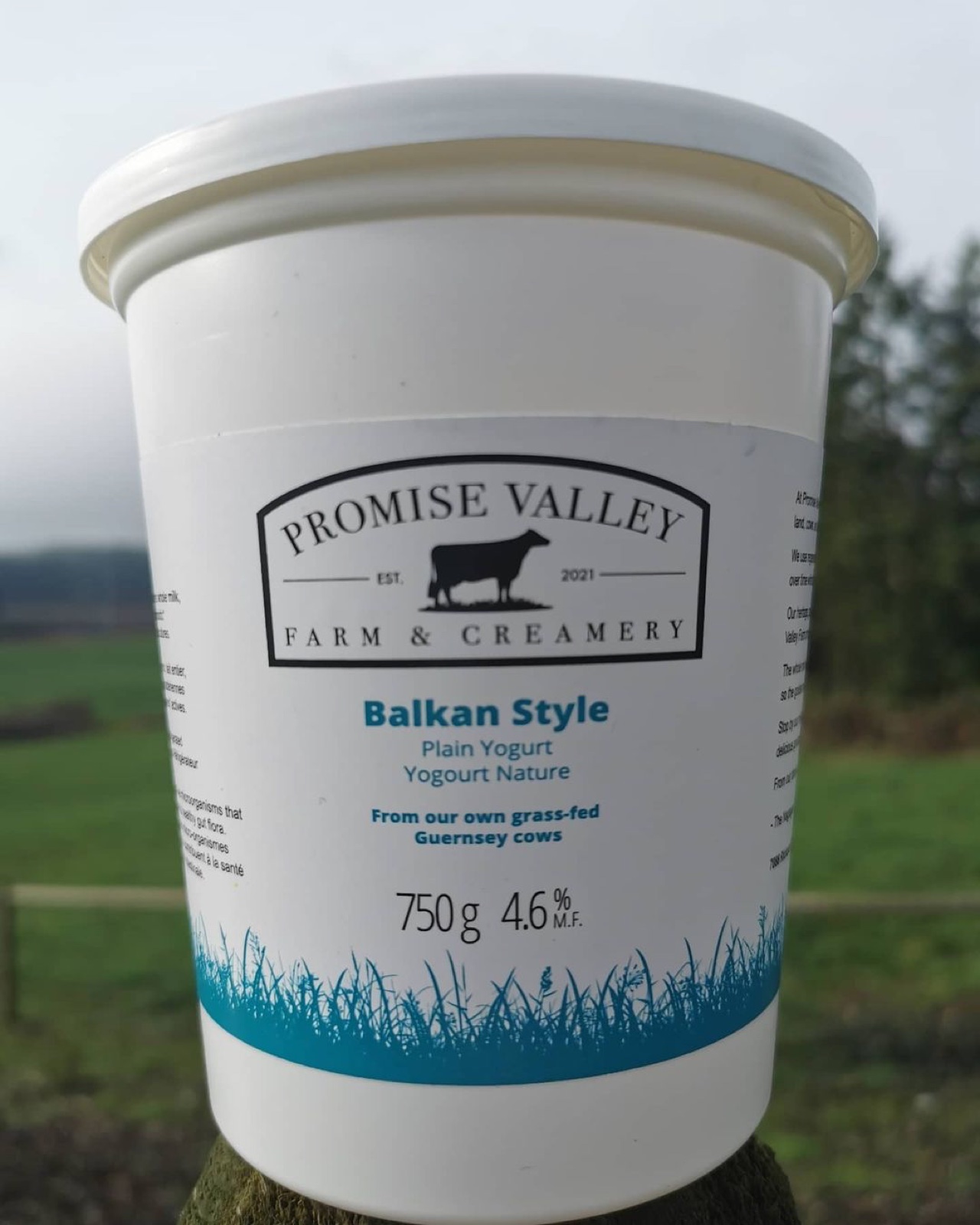
Each grass illustration was drawn by hand rather than pulled from stock. The goal was to make the packaging feel like it came from a real farm rather than a template. Even the blades of grass lean and curl differently on each variant.
Built for Regulated Food Packaging
A yogurt label does more than look good on a shelf. It has to carry the full weight of food packaging regulation while still reading as a brand.
Every variant had to accommodate:
- Bilingual French and English copy (Canadian regulation)
- Nutrition Facts panels
- Full ingredient lists
- Organic and A2A2 certification marks
- Weight, fat content, and best-before zones
- Dieline constraints from the container manufacturer
The final labels wrap the full circumference of the 750g container, with the front-facing area forming only about a third of the total printed surface. Every detail was designed to meet the regulatory requirements and still feel like a brand you’d want on your kitchen counter.
The result is a label that reads clean and confident from across the dairy aisle and rewards close inspection at home.
On the Road
Product on a shelf is one side of the brand. Product arriving at that shelf is the other.
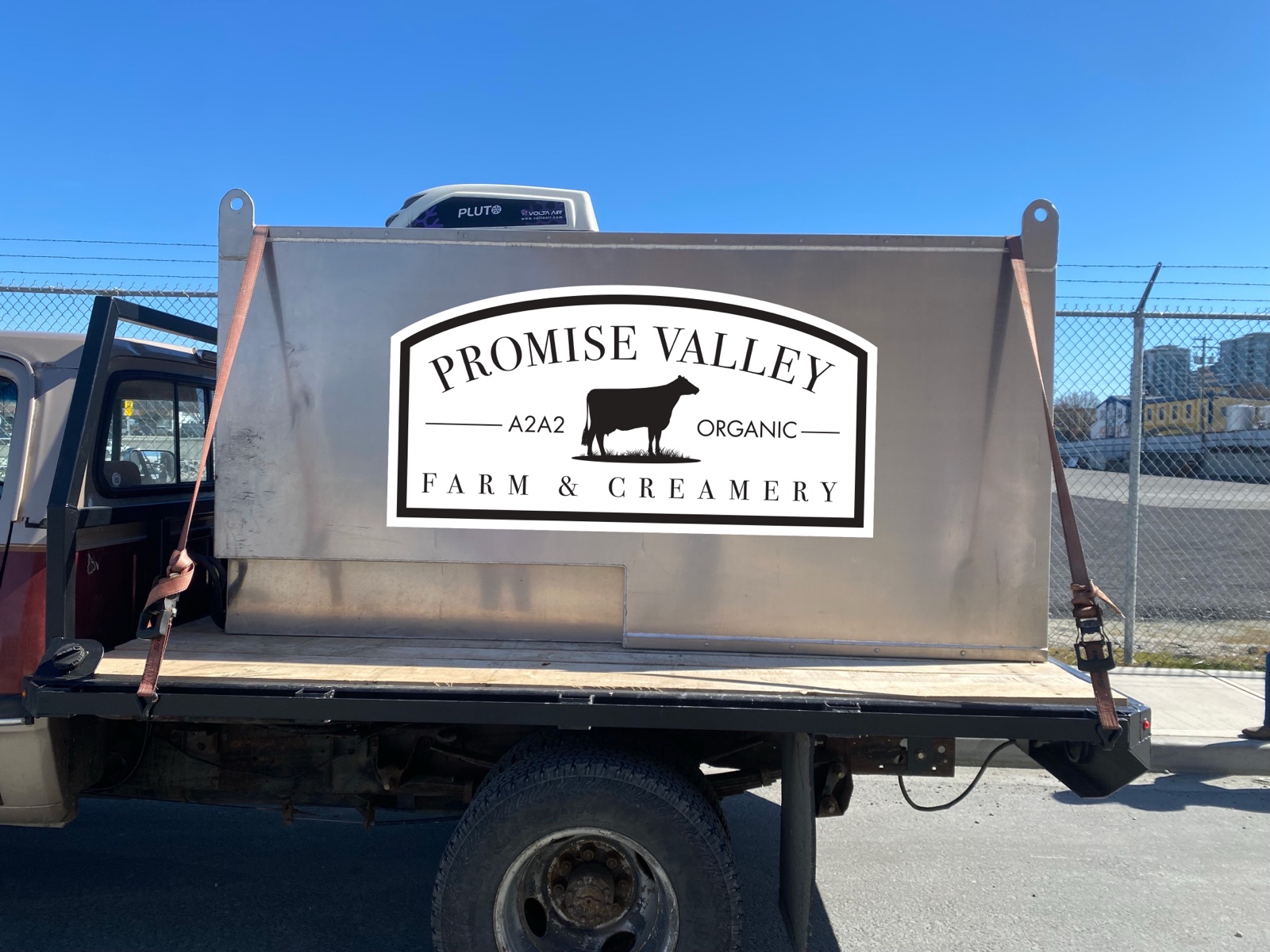
The delivery truck is an older Dodge Ram with a stainless steel milk hauler bed, exactly the kind of hardworking farm vehicle you’d expect from a small organic dairy. A polished corporate wrap would have felt wrong. Instead, the logo was applied simply on both sides of the hauler and on the rear door.
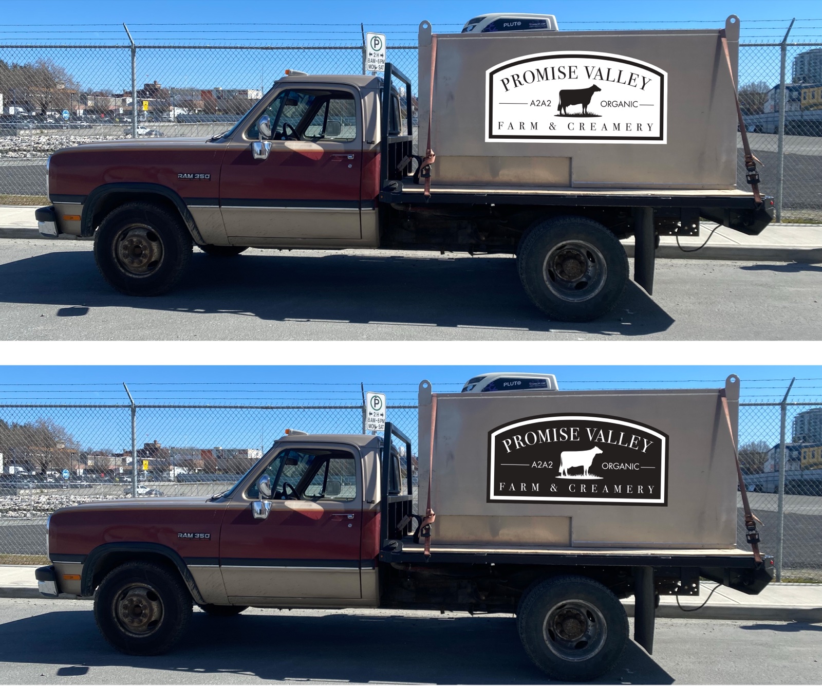
The vehicle stays what it is. The brand just rides along.
The Result
Promise Valley Farm yogurt now sits on refrigerated shelves across Vancouver Island. The three-flavour lineup is instantly recognizable, and shoppers who buy one flavour tend to come back for the others because the system makes the connection obvious.
The brand works as hard on a small farm sign as it does on a competitive grocery shelf. The A2A2 Organic variant gives the farm the flexibility to lead with heritage or with certification depending on the context. And the packaging system can absorb future flavours without needing a redesign: each new variant just needs its own accent colour and grass illustration.
That’s the thing about a well-built identity system. It doesn’t just solve the launch. It keeps solving as the business grows.