 Marine & Hydraulics
 Island Hydrostatics: Marine & Hydraulics Brand Identity
14 min read
A Vancouver Island brand identity for a hydraulic cylinder specialist. Two distinct concept directions, twenty oranges narrowed to one, and a final mark that puts the geography and the work into a single shape.
The Brief
Justin Kovac runs Island Hydrostatics out of Parksville — a hydraulic cylinder repair and manufacturing shop serving marine, forestry, and industrial clients across Vancouver Island. The work is heavy, precise, and unglamorous: rebuild the failed cylinder on a logging skidder, fabricate a replacement for a fish-boat hydraulic ram, source the right hose and fittings, ship it back out to the operator before the day costs anyone a contract.
A brand for that kind of business has to do two things at once. It has to feel industrial enough that the customer trusts the work — this isn’t a boutique service, it’s the shop you call when something is leaking fluid all over your deck. And it has to feel distinct enough that it doesn’t blend into the wall of clip-art logos that dominate the trades: generic blue wordmarks, generic gear icons, generic safety-orange chevrons.
The other constraint was geographic. Island Hydrostatics is named after the place. The brand had to make that location feel deliberate, not incidental — so a Vancouver Island operator scanning for a hydraulic shop would recognize the brand as theirs before they read the wordmark.
Two Directions
The exploration phase produced two concepts that pushed in opposite directions.
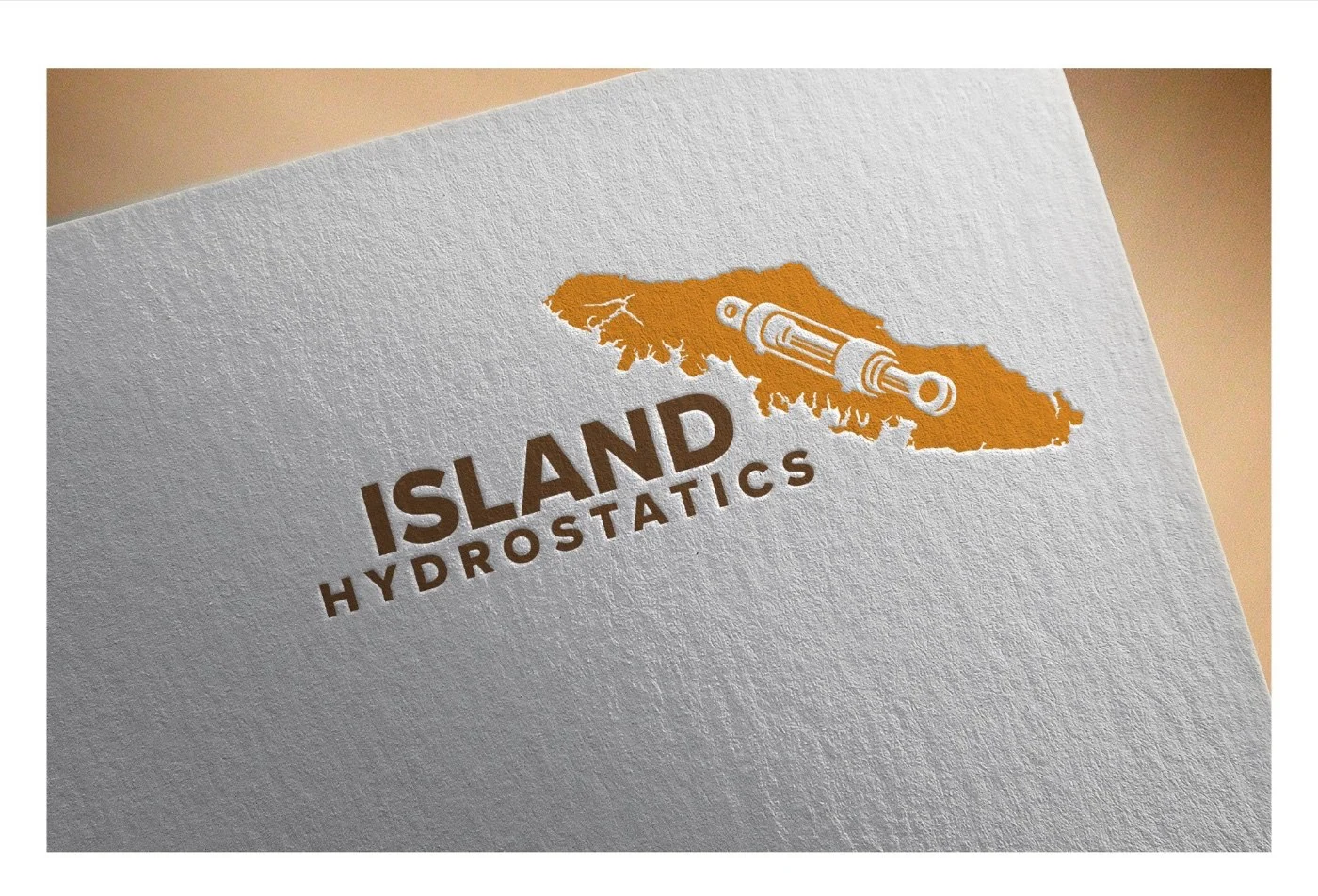
Island put the geography first. A Vancouver Island silhouette filled with saturated orange formed the icon, with a technically-rendered hydraulic cylinder integrated into the centre of the island shape — the cylinder reading like a mountain range cutting across the land. The wordmark sat beneath in a heavy sans serif. Pictorial, location-rooted, unmistakable as a Vancouver Island business from the first glance. The cylinder told the second half of the story without needing a tagline to spell out the service.
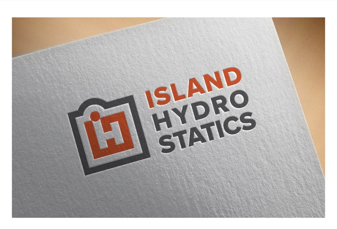
iH Monogram flipped the approach. A square badge held a custom iH letter combination — the lowercase i and uppercase H fused into a single graphic shape, with negative space cut to form the letterforms inside an orange field. The wordmark stacked alongside in a heavy sans, broken to ISLAND / HYDRO / STATICS across three lines. More typographic, more contemporary, more at-home on a hardware-store loyalty card or an industrial supplier’s wholesale catalogue. Where Island said we are this place, iH Monogram said we are this category.
Each direction was presented across the same application set so Justin could see both on the surfaces his business would actually live on.
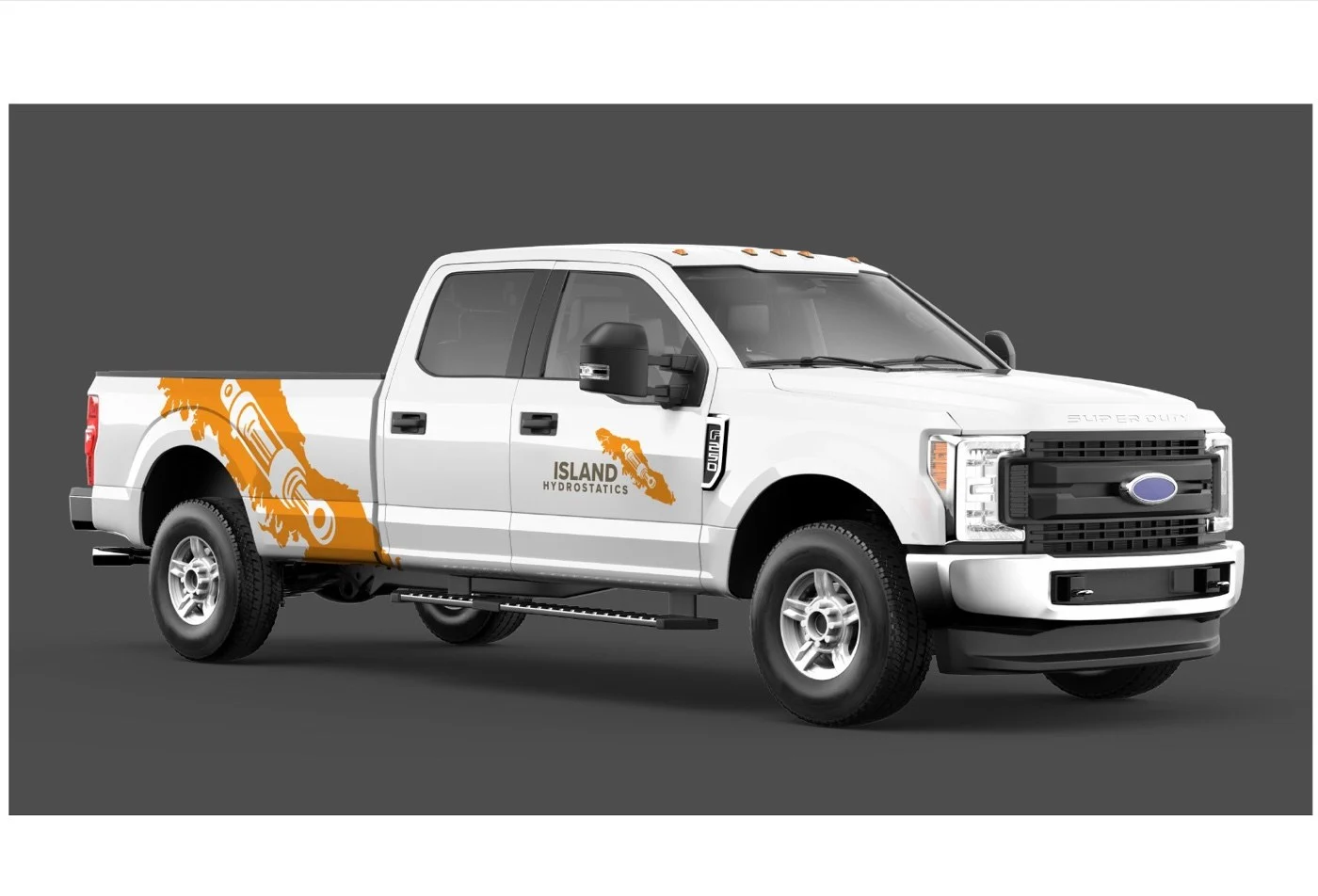
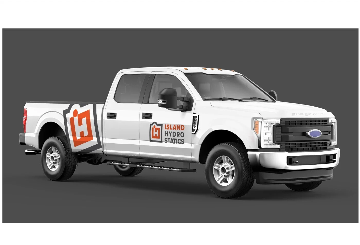
The truck mockups were the deciding surface. Each direction got the F-250 — the shop’s actual service vehicle — with the icon scaled up to an enormous side-panel application. The Island direction exploded the silhouette across the panel like a topographic map of the route the truck would actually drive. The iH direction rendered the badge as an oversized graphic shape, more like a brand emblem on a corporate fleet.
Four Colours, Two Marks
Both directions were also tested across a four-colour matrix on the same letterpress treatment, so the colour decision wouldn’t get tangled with the form decision.
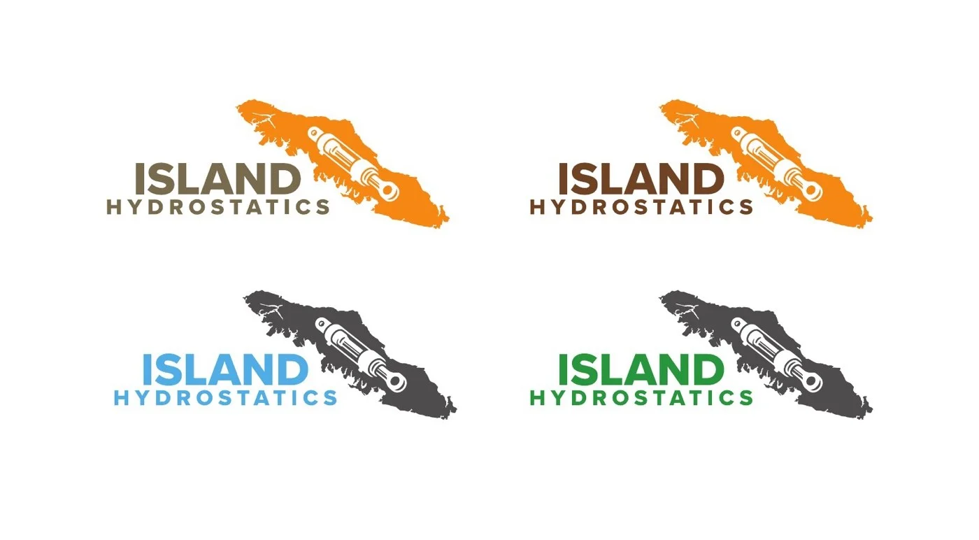
For the Island direction, four palettes: saturated orange with cocoa wordmark, dark forest green, bright blue, and charcoal grey. Each carried different industry signals. Green pulled toward forestry. Blue pulled toward marine. Orange pulled toward heavy equipment and trades. Charcoal pulled toward industrial supply.
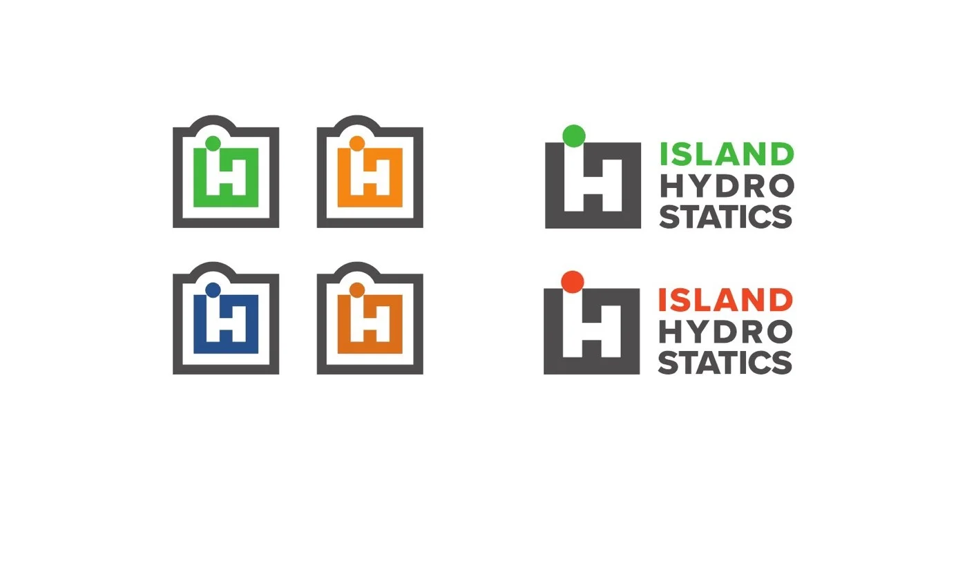
The iH Monogram got a parallel four-up exploring the same hue space. The badge form gave the colour exploration more flexibility — the icon could split between two colours where the Island silhouette read as one solid shape.
The orange variant in both directions held the most weight. It sat in the warm-industrial space the brief asked for without defaulting to safety orange or construction yellow — the two cliché trades-brand defaults that every competing local operator was already using.
The Direction Justin Chose
Island won, and the geography did the deciding.
A monogram is a corporate-identity move. It works hardest when the company name is long, abstract, or operates at a scale where the brand needs to compress into a single graphic. iH could have lived on a national supplier’s product packaging or a multi-location franchise. For a single-shop hydraulic specialist whose entire competitive position is we are right here, on this island, ready to drive to your jobsite this afternoon, the monogram pulled in the wrong direction. It felt larger than the business actually was.
The Island silhouette did the opposite. It made the brand specific to the place. A Vancouver Island operator scanning for a hydraulic shop sees the silhouette before they read the wordmark, and the geographic recognition does the first round of work — this is a local operator — before the cylinder integration tells them what the service is.
Twenty Oranges
Once the direction was chosen, the colour work narrowed. Orange was the right hue family, but which orange mattered. A bright tangerine reads as fast-food signage. A muted rust reads as antique typewriter. Safety orange reads as construction-zone tape. The exact orange had to land in a specific narrow band: warm enough to feel grounded, saturated enough to read at distance, distinct enough to not collapse into the trades-default colour vocabulary.
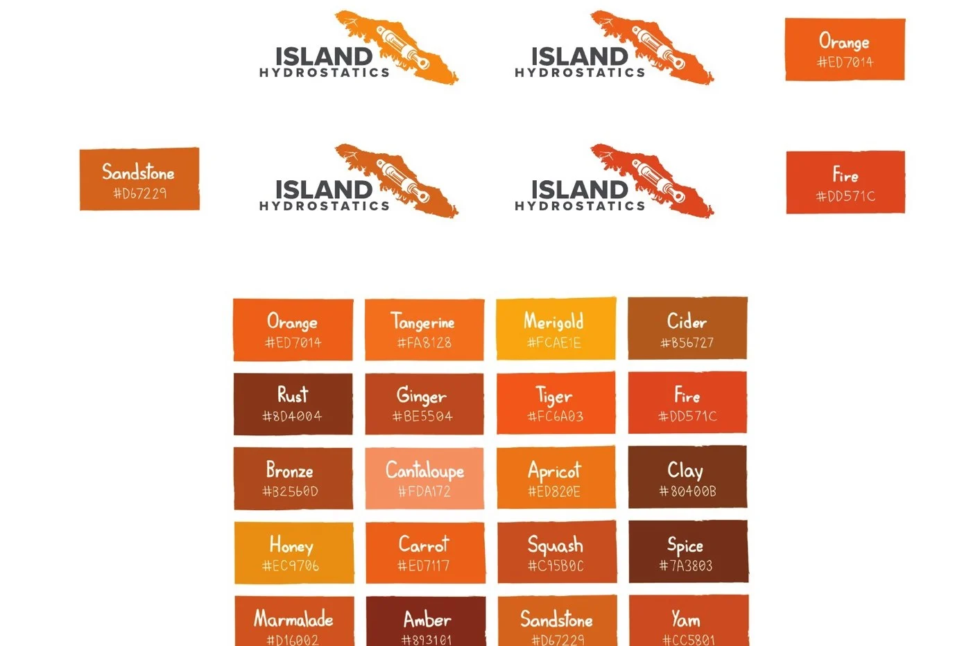
A twenty-swatch matrix worked the question end-to-end. Orange, Tangerine, Marigold, Cider, Rust, Ginger, Tiger, Fire, Bronze, Cantaloupe, Apricot, Clay, Honey, Carrot, Squash, Spice, Marmalade, Amber, Sandstone, Yam. Each swatch labelled by name and hex value, each pulled from the same warm half of the spectrum but pushed at slightly different temperatures and saturations.
Three finalists got tested directly on the mark for side-by-side comparison: Orange (#ED7014), Sandstone (#D67229), and Fire (#DD571C). With the swatches abstracted to colour theory and then immediately mocked up on the working logo, the decision became visible rather than intuited.
The chosen orange sits in the band between Sandstone and Fire — warm enough to feel earth-toned, saturated enough to read confidently across a parking lot, brighter than rust but never crossing the line into safety-vest territory. The kind of orange that signals industrial trade without signalling highway construction.
v1 to Final
The chosen direction went through one more refinement round before delivery.
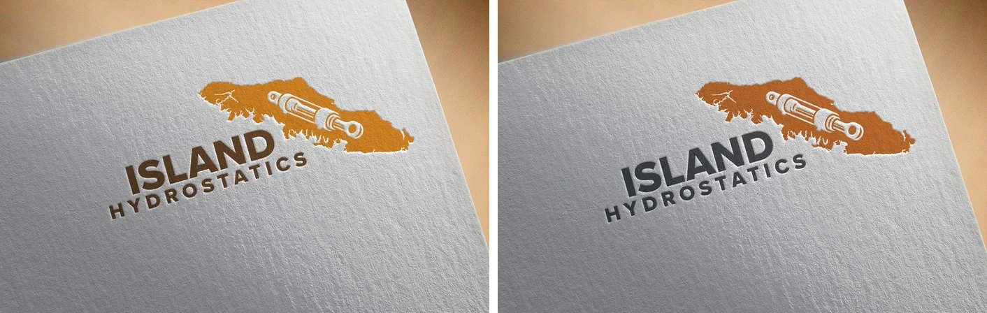
The v1 mark on the left got the concept across — the island and cylinder were already integrated, the orange was already in the right band, the lockup was already balanced. But the silhouette read as a single approximate shape, the cylinder competed with the surrounding land mass, and the wordmark in cocoa-brown muddied the contrast against the orange field.
The final version on the right tightened every layer. The Vancouver Island silhouette gained detail — the textured top edge now reads as the small archipelago of offshore islands that actually sit north of Vancouver Island proper, giving the mark a level of geographic accuracy the v1 only suggested. The hydraulic cylinder rendering sharpened: the rod, the piston body, the mounting eye, and the hydraulic port all gained definition, so the cylinder reads as a real piece of engineering rather than an iconographic stand-in. The wordmark switched from cocoa-brown to a graphite grey, lifting the contrast against the orange and giving the lockup more confidence on the page.
Same concept, finished. The kind of refinement round that doesn’t change what the brand is — only how convincingly it gets there.
Inside the Mark
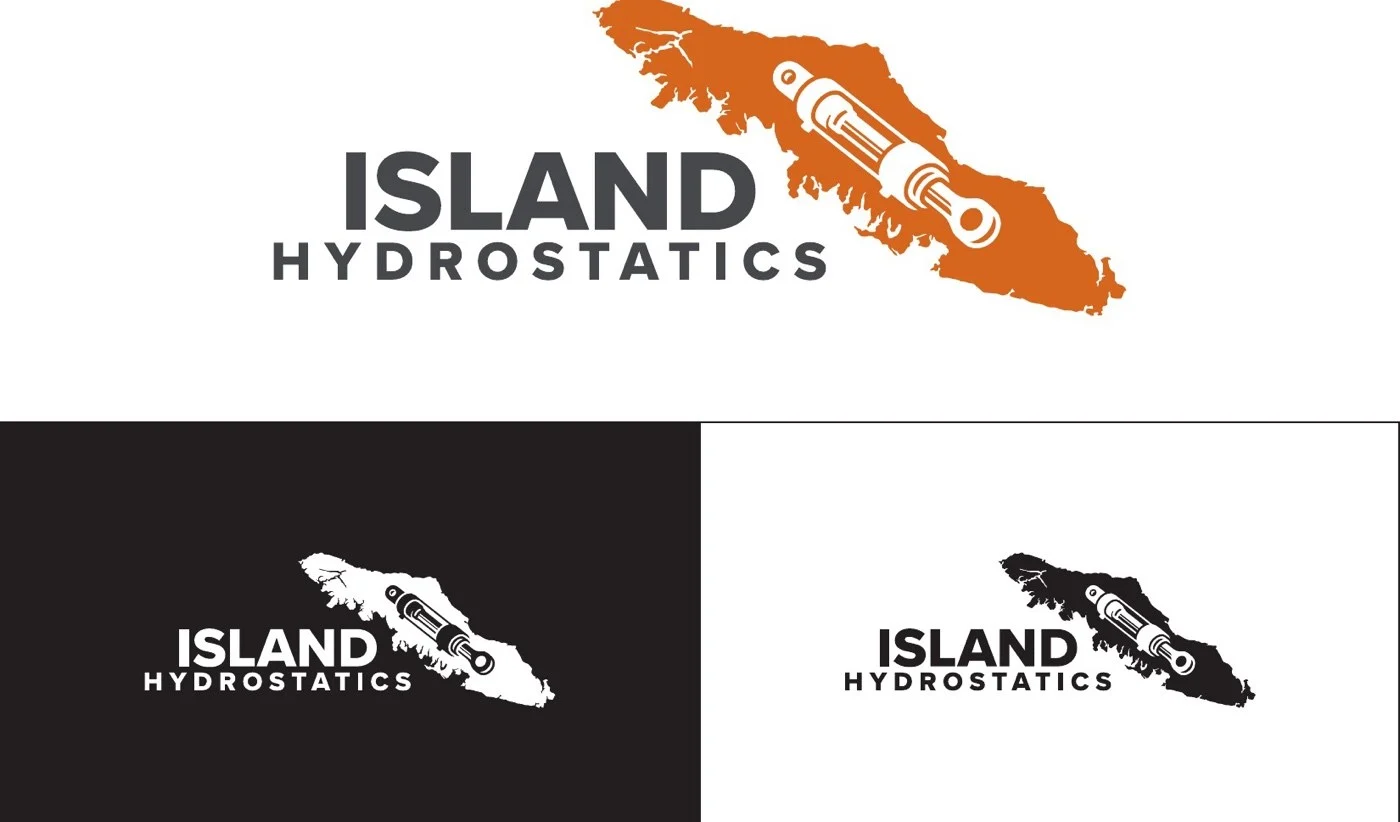
The mark is a single integrated shape. The orange Vancouver Island silhouette is the carrier; the hydraulic cylinder is cut out of the silhouette as negative space, with the cylinder’s metal rendering shown in white-and-grey through the cutout. There is no separate icon-plus-wordmark composition where the elements live next to each other — the geography and the equipment occupy the same footprint, and that fusion is the whole point.
The cylinder’s orientation is deliberate. It runs at the same diagonal as the island itself — a slight tilt from lower-left to upper-right — so the mechanical element follows the geographic line rather than fighting it. The mounting eye sits at the south end of the island near where Victoria would be; the rod extends north toward where Port Hardy sits. A small detail no viewer will consciously parse, but one that keeps the cylinder feeling like it belongs inside the silhouette rather than overlaid on top.
The wordmark is set in a heavy geometric sans, all caps, with ISLAND sitting larger above and HYDROSTATICS in a smaller tracked-out treatment underneath. The hierarchy mirrors the icon: the place reads first, the service reads second.
The mark works in three primary lockup treatments — full colour on white, white-on-graphite for dark backgrounds, and a reverse white-on-orange for high-contrast applications. Each was delivered as a vector master with print-ready CMYK and Pantone variants, so the orange would hold its tone whether printed offset, screen-printed onto fabric, or applied as vehicle vinyl.
Sandstone and Graphite
The two-colour palette closes the brand system with the same logic the icon uses.
The chosen orange does the location-and-warmth work. It places Island Hydrostatics in the warm-industrial band — the colour space of working trades that take pride in craft, adjacent to small-batch coffee roasters and heritage outdoor outfitters rather than commercial fleet operators. It’s a colour that says we run a real shop rather than we are a regional franchise.
The graphite grey of the wordmark does the credibility work. Heavier than charcoal, lighter than pure black, it reads as engineering-spec rather than corporate-default. Pair it with the orange and the brand sits in a specific cultural position: trades, but considered. Industrial, but not cold. The kind of shop that knows the difference between the right hose for the job and the cheapest hose that fits.
The combination also reverses cleanly. Orange-on-charcoal for shop apparel, white-on-orange for high-visibility touchpoints, full-colour-on-white for stationery and digital. The system stays recognizable across every contrast direction without needing a separate identity for each.
Across Every Surface
The application set was built for a working trades business — the surfaces a hydraulic shop’s brand actually has to live on, sized for the real conditions they get used in.
The F-250 is the brand’s most-public surface. Justin’s truck pulls into industrial yards, fishing-boat docks, and forestry sites, and the wrap had to read as Island Hydrostatics from the moment the vehicle came over the hill. The side panel uses the island silhouette at oversized scale — exploded large enough to consume the space from wheel arch to wheel arch. The door panel carries the standard lockup at a handshake-distance scale. Two scales of the same mark on the same vehicle: the giant version says Island Hydrostatics is here, the small version says here is how to reach Island Hydrostatics.

On letterpress stationery the mark earns its first quiet handshake. The orange sits deep into the textured paper, the graphite wordmark holds clean against the cream ground. Letterpress is a deliberate signal — a card stock and a print process that says this shop pays attention to its details before the recipient has read a single word of the contact information.
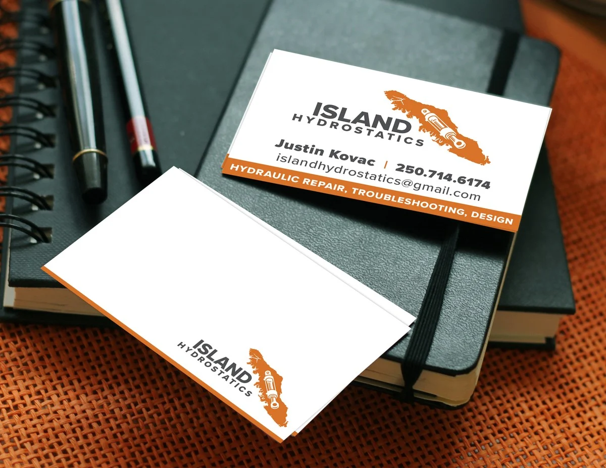
The business card layout went through four refinement rounds, tightening the contact hierarchy, the orange service-line strip, and the back-of-card mark scale. The front carries the full mark with contact details and a single-line service descriptor. The back keeps the mark small against an open white field — an intentional restraint that lets the recipient see one clean shape rather than a wall of secondary information.
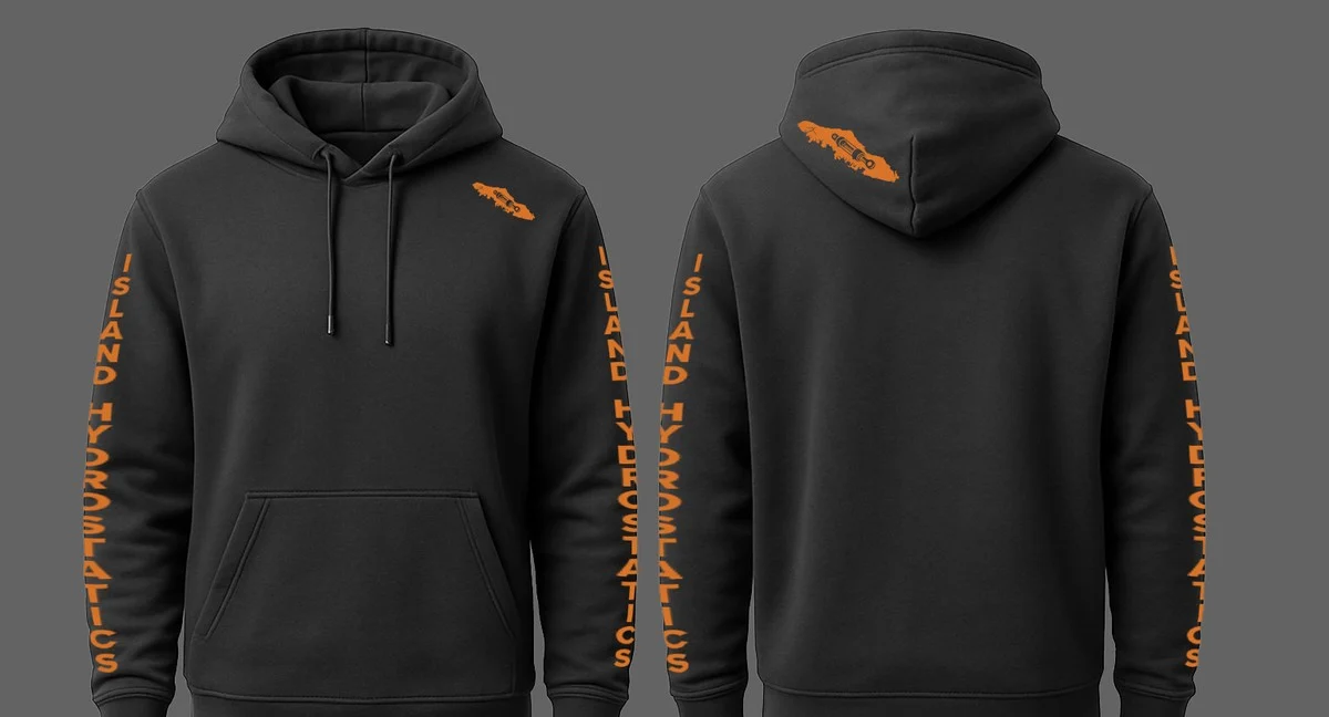
Shop apparel got its own treatment. The hoody chest patch carries the small island silhouette only — no wordmark, just the geographic shape — at a scale that reads as the shop’s identifier across a workshop floor. The sleeve application splits ISLAND and HYDROSTATICS vertically down each arm, so the brand reads whether the wearer is facing the customer or working under a hood. The hood itself carries another small island patch on the back. Apparel that reads as crew gear rather than promotional giveaway.
The Result
Island Hydrostatics now operates with an identity built specifically for the way the business actually works: location-rooted, technically credible, warm enough to invite a phone call, industrial enough to back the work. The Vancouver Island silhouette gives the brand its geographic claim without needing a tagline. The integrated cylinder gives it its service category without needing an icon library. The sandstone-orange-and-graphite palette places it in a colour space the local competition wasn’t already occupying.
The system has held up through four years of real use — service trucks rotated, business cards reprinted, apparel orders for the shop crew, ongoing print and digital deliverables as the shop has grown into its identity. A trades brand that earns its keep on the side of a pickup truck, on a card handed to a fish-boat captain, and on the back of a hoody worn under a forestry-grade rain shell.
What Justin Said
“Sean executed an outstanding job in designing our logo. His creativity and diligent efforts transformed our vision into reality. We frequently receive compliments regarding our logo. Additionally, Sean created various versions of our logo for custom apparel! I highly recommend Sean to anyone in need of logo design.”
Justin Kovac, Island Hydrostatics