 Commercial Cleaning
 EcoVista Cleaning Solutions: Commercial Cleaning Brand Identity
10 min read
A green-and-bronze brand identity for an eco-friendly commercial cleaning company. Two directions, twelve colour variants, three motion mockups, and a final mark that reads as sustainable from twenty feet away.
The Brief
Noah James runs EcoVista Cleaning Solutions Ltd., a commercial cleaning operation built around a simple differentiator in a crowded market: actually-green cleaning, delivered by an actually-green brand.
The commercial cleaning industry’s visual vocabulary is predictable. Sterile blue wordmarks. Clinical white backgrounds. Stock photos of water droplets and gleaming windows. A sector that markets the absence of dirt tends to design itself into the absence of personality too. For a company whose entire pitch is we use sustainable products and practices, blending into that visual sea would erase the point of the business.
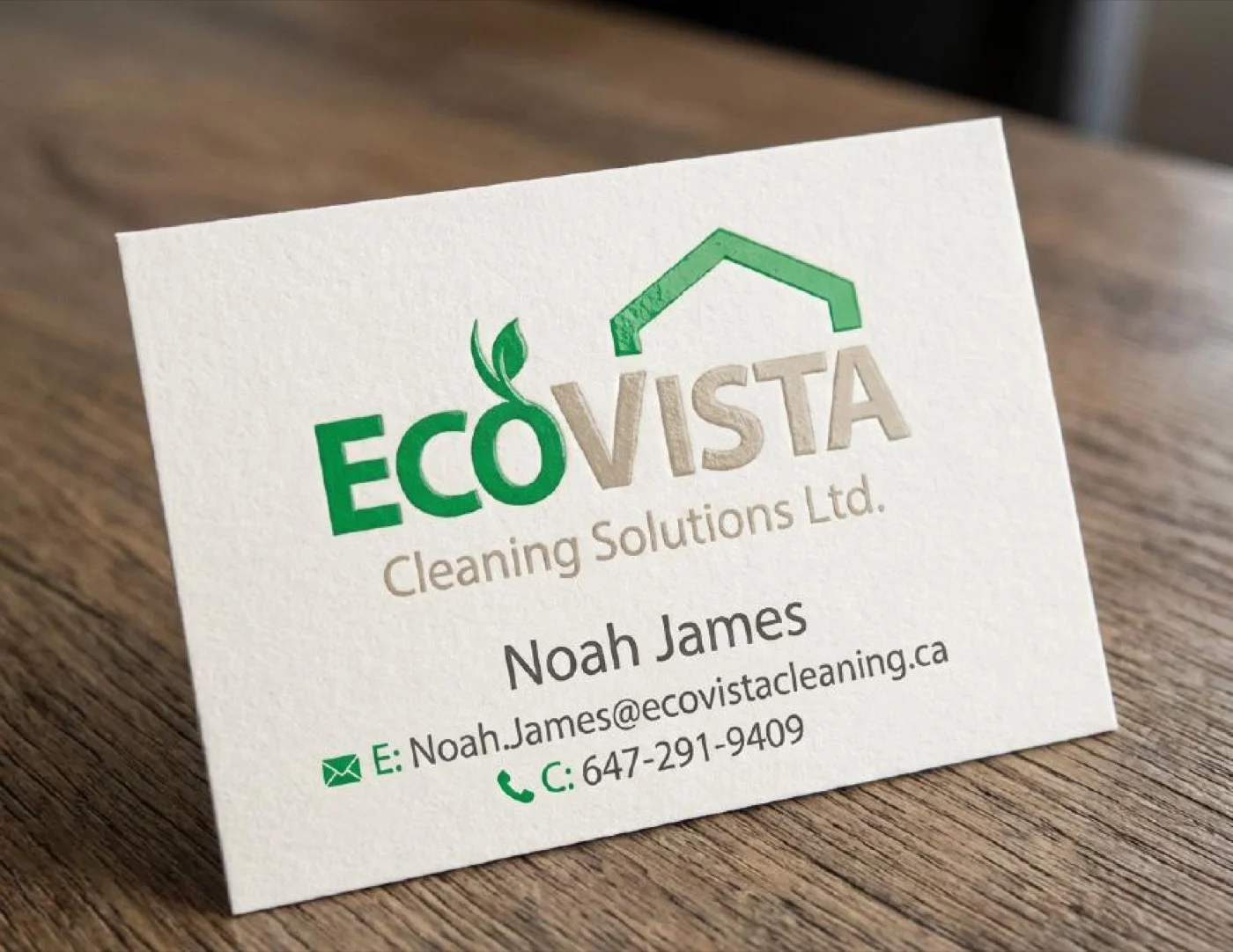
The identity needed to signal eco before the reader finished the company name. It needed to feel professional enough to win commercial contracts in boardrooms, but warm enough to hand a homeowner a thank-you card and not feel like a power-washing company. And it needed to hold up across the fullest application set in the corpus so far — business cards, door hangers, brochures, stationery, lanyards, a fleet van, and a set of motion deliverables for digital marketing.
Looking at the Competition
Noah came in with reference material — a small set of competitor logos from other cleaning operators working the same regional market. Blue rectangular wordmarks. Clip-art soap bubbles. Logos that could be swapped between businesses without anyone noticing. The reference set was there as a negative space: this is what we don’t want to look like.
It shaped the whole brief. The brand couldn’t use the industry’s default palette. It couldn’t use a mop-and-bucket icon. It needed to live in a different colour space entirely.
Two Directions
Two concepts came out of the initial round, each approaching the eco-plus-cleaning problem from a different angle.
Ecovista Evergreen put the leaf first. A large green leaf shape carried the identity, with a small white house silhouette nested inside the leaf’s interior — the house tucked under the leaf’s natural curve like a building sheltered by foliage. The eco signal came first; the home-service signal came on the second read. Pictorial, warm, unmistakable as an environmental mark from across a parking lot.
EcoVista Living flipped the hierarchy. A minimal architectural roofline — two pitched lines meeting at a peak, nothing more — sat above the wordmark, with a small green leaf sprouting from the ridge. The home-service signal came first; the eco signal came on the second read. More restrained, more typographic, more at-home on a premium brochure than on a lawn sign.
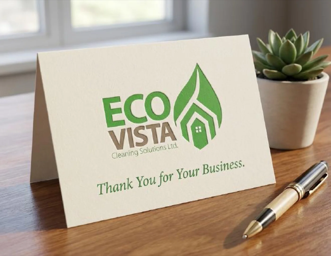
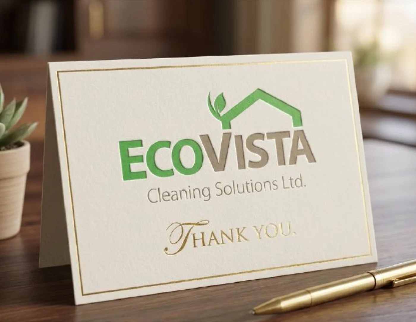
Each was presented across the full application set — thank you cards, door hangers, business cards, brochures, lanyards, stationery, and a fleet van — so Noah could see both directions on every surface before making a call.
A Colour Matrix
Instead of picking a single winner between the two directions, the work continued. Both concepts went through a refinement round focused specifically on the colour problem.
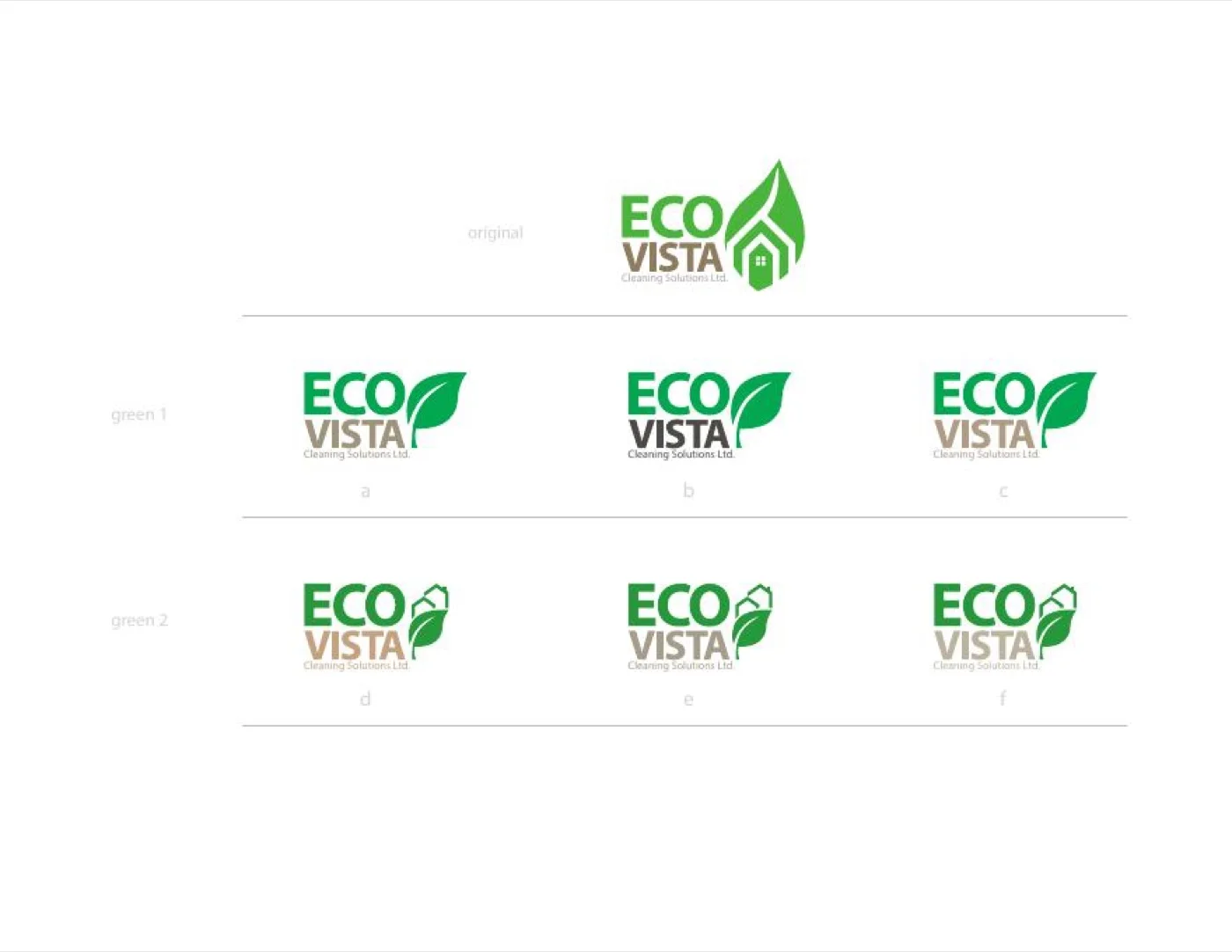
Twelve variants in total got worked up. Two green palettes tested against each other — a bright single-green tone labelled Green 1, and a two-tone Green 2 that paired bright green with a warm bronze. For each palette, three Eco + Vista colour assignments explored where each colour should sit: both words in the primary, Eco in the primary and Vista in the secondary, or the inverse. Six variants per palette, two palettes, a grid that made the colour decision visible rather than intuited.
The matrix was the deciding tool. With all twelve side-by-side, Green 2 option f — bright green Eco above bronze Vista — read as the most confident on both the bright leaf icon and the minimal roofline. The bronze pulled the mark out of the all-green territory the industry already lived in, while keeping the leaf’s green intact as the primary eco signal. The bronze also bought the brand warmth — a cue that positioned EcoVista closer to premium boutique service and further from commercial janitorial franchise.
Two Ideas, One Mark
![]()
The final mark didn’t pick Evergreen or Living. It took the best of both.
The leaf-dominant icon from Evergreen kept the ecological signal strong — the leaf is still the first thing the eye reads. The integrated house silhouette, drawn cleaner and positioned at the top of the leaf where the stem would be, carried forward the architectural specificity from Living. The two-colour ECO + VISTA wordmark came directly out of the colour matrix — bright green on top, warm bronze beneath, Cleaning Solutions Ltd. descriptor in smaller bronze type to close the lockup.
One mark, two concepts resolved into a single system. The synthesis works because each half does its own job without fighting the other: the leaf tells you what the company stands for, the house tells you where they work, and the wordmark tells you who they are.
Inside the Mark
The construction is more deliberate than a quick glance suggests.
The leaf is a single shape, not a composition of sub-elements. Its silhouette is asymmetrical — the left side of the leaf is a smooth outer curve while the right side has a soft inward bend at the midpoint, the way a real leaf turns on its axis when you pluck it. The internal vein runs vertically down the centre, stopping just short of the tip.
The house silhouette nests at the top of the leaf, where the stem would attach. It’s drawn with a pitched roof and a simple rectangular body, with a small square-paneled window in the centre — a deliberately domestic detail that signals we work in homes. The house sits small against the leaf — roughly the top fifth of the total icon — so the eco reading dominates and the home-service reading follows.
To the left of the icon, ECO is set in a heavy geometric sans, all caps, in a bright saturated green. VISTA sits directly beneath in the same weight and size but in warm bronze — a deliberate mismatch that makes the two syllables read as two words rather than one compound. A small Cleaning Solutions Ltd. descriptor sits beneath in a lighter bronze weight, centered under VISTA, closing the lockup with a measured support line.
The mark works at every scale the application set demands. On a van door it reads across a driveway. On a lanyard ID it reads in a handshake. On a browser tab as a favicon, the leaf alone carries the brand — which is part of why the leaf had to dominate the composition.
Green and Bronze
The palette was the most strategic decision in the whole project.
Bright green does the eco work — specifically, a saturated grassy green rather than a forest green or a sage. The choice was about visibility more than accuracy. A muted green would have been more technically realistic as a leaf colour, but would have defaulted to the wellness-brand palette every organic cleaning startup uses. The brighter green keeps the brand energetic rather than meditative, and reads more confidently against the white surfaces (business cards, brochures, vans, door hangers) where the identity mostly lives.
Warm bronze does the differentiation work. It’s the colour the industry doesn’t use. Where competing cleaning brands default to blue, silver, or grey for their secondary type, bronze places EcoVista in an adjacent-but-distinct visual space — closer to hospitality and heritage than to industrial services. It’s the colour of copper, of aged leather, of the accent hardware on a premium kitchen remodel. The brand doesn’t just mean eco cleaning. It means eco cleaning for the kind of home where bronze hardware would be fitted.
Together, the two colours do what the brief asked: they get EcoVista out of the commercial-cleaning colour sea and into a palette that signals different service, different tier before the reader has finished parsing the wordmark.
Across Every Surface
The identity was delivered with a full set of motion mockups alongside the static deliverables — animations of the brand rendering onto brochures, stationery, websites, door hangers, thank you cards, and the fleet van.
The brochure and stationery animation shows the printed system — a tri-fold brochure, letterhead, envelopes, and business cards — arranged on a wooden desk. The motion lets the mark read across each surface in sequence rather than forcing the viewer to scan a static flatlay.
The iPhone website and door hanger animation shows the digital and physical customer-acquisition touchpoints. The mobile website leads with the leaf-and-house icon above the fold; the door hanger uses the same hierarchy scaled down onto a single vertical panel that a homeowner pulls off the handle and reads in under a second.
The thank-you card and van animation closes the loop on the customer journey. The van is where a new client first sees the brand pull into their driveway. The thank-you card is what they receive after the first clean is complete. Same mark, same palette, opposite ends of a relationship.
The Result
EcoVista Cleaning Solutions now has an identity that’s been built for the full scope of a commercial cleaning business — static print deliverables, digital touchpoints, vehicle graphics, motion marketing, and a full-coverage brand guidelines document to keep the system consistent as the business grows.
The leaf-and-house mark reads as eco before the viewer has consciously processed the company name, which is the entire point of the brief. The green-and-bronze palette places the brand somewhere the commercial cleaning industry’s default blue-and-white never goes. And the motion deliverables give Noah a set of marketing assets ready to drop into social, web, and video advertising without a separate design pass.
It’s a brand that does all the work a visual identity can do before a single square foot of a client’s floor gets cleaned.