 Technology
 Canadian Cybersecurity Inc: Technology Brand Identity
6 min read
A brand built for a national cybersecurity firm that needed technical authority across every surface — from a business card to a transit shelter billboard.
The Brief
Canadian Cybersecurity Inc protects businesses across Canada from digital threats. The clients entrusting them with that work need to believe — before the first meeting, from the first impression — that they’ve found the right firm.
CCI needed a brand identity that matched the seriousness of what they do. Technical authority and trustworthiness, communicated without defaulting to the fear-based imagery that saturates the industry. A logo and colour palette that would anchor a full website design across multiple page templates, then stretch to physical applications: vehicle branding, business cards and stationery, event collateral, and large-format advertising at transit shelter scale.
Before any of that could be solved, the mark had to be right.
The First Direction

The shield is the oldest symbol of protection in visual language. In cybersecurity branding, it’s everywhere — because it’s not wrong. Strength, coverage, defence: the shield earns its place.
The early work leaned into that logic. A shield-and-leaf concept, clean and geometric, placed CCI squarely within the established vocabulary of its industry. It was credible. It worked.
But credible isn’t the same as right.
The Pivot
The problem with the shield wasn’t that it failed — it was that it fit too easily. A firm protecting Canadian businesses from digital threats needs a mark that says this kind of security, for this kind of work, in this country. A borrowed symbol from the vocabulary of physical defence doesn’t quite get there.
The pivot was from protection-as-defence to protection-as-access control. A padlock is still a security symbol, but it operates differently than a shield. It’s precise rather than broad. It’s the actual mechanism of digital security — authenticate, lock, control — not the metaphor borrowed from armour. And unlike the shield, it had room to carry two more ideas: Canadian identity, and technical specificity.
The new direction: a padlock mark that integrated a maple leaf and circuit board geometry. Three symbols, each earning its place.
The Mark
![]()
The construction rewards a close look.
A charcoal padlock shackle arcs over the top — the universal shape of digital security. Below it, where the padlock body would be, sits a red maple leaf. Not placed beside it, not floating next to it: the leaf fills the lock body completely. The padlock and Canada share the same space. A keyhole is cut into the maple leaf’s centre, so the mechanism of access control sits at the heart of the Canadian identity.
Below the lock, circuit board traces and nodes extend downward in charcoal — the physical substrate of digital infrastructure, grounding the whole mark in the technical world it actually operates in.
Three elements, one integrated form. The padlock says security. The maple leaf says Canada. The circuit says digital. But none of them are simply stacked together — they’re the same object, which is what makes the mark work rather than just explain itself.
The wordmark extends the logic. CANADIAN is set in charcoal, matching the padlock’s structural grey. CYBERSECURITY is set in red, matching the maple leaf. INCORPORATED sits beneath in the same charcoal, letterspaced and measured. The two-colour type system echoes the mark directly: the noun is red, the modifier is grey, and a reader who looks at the wordmark after seeing the mark understands why.
![]()
Charcoal and red is a considered choice for this industry. Red here isn’t alarm or urgency — it’s the Canadian flag. Charcoal isn’t corporate black — it’s the colour of a circuit board, of technical precision. Together they project authority without reaching for the fear-based palette that most cybersecurity firms default to.
The Collateral

The business cards are where authority gets handed across a desk. The mark anchors the layout; the contact information has room to breathe. The kind of card that goes into a holder rather than a pocket.
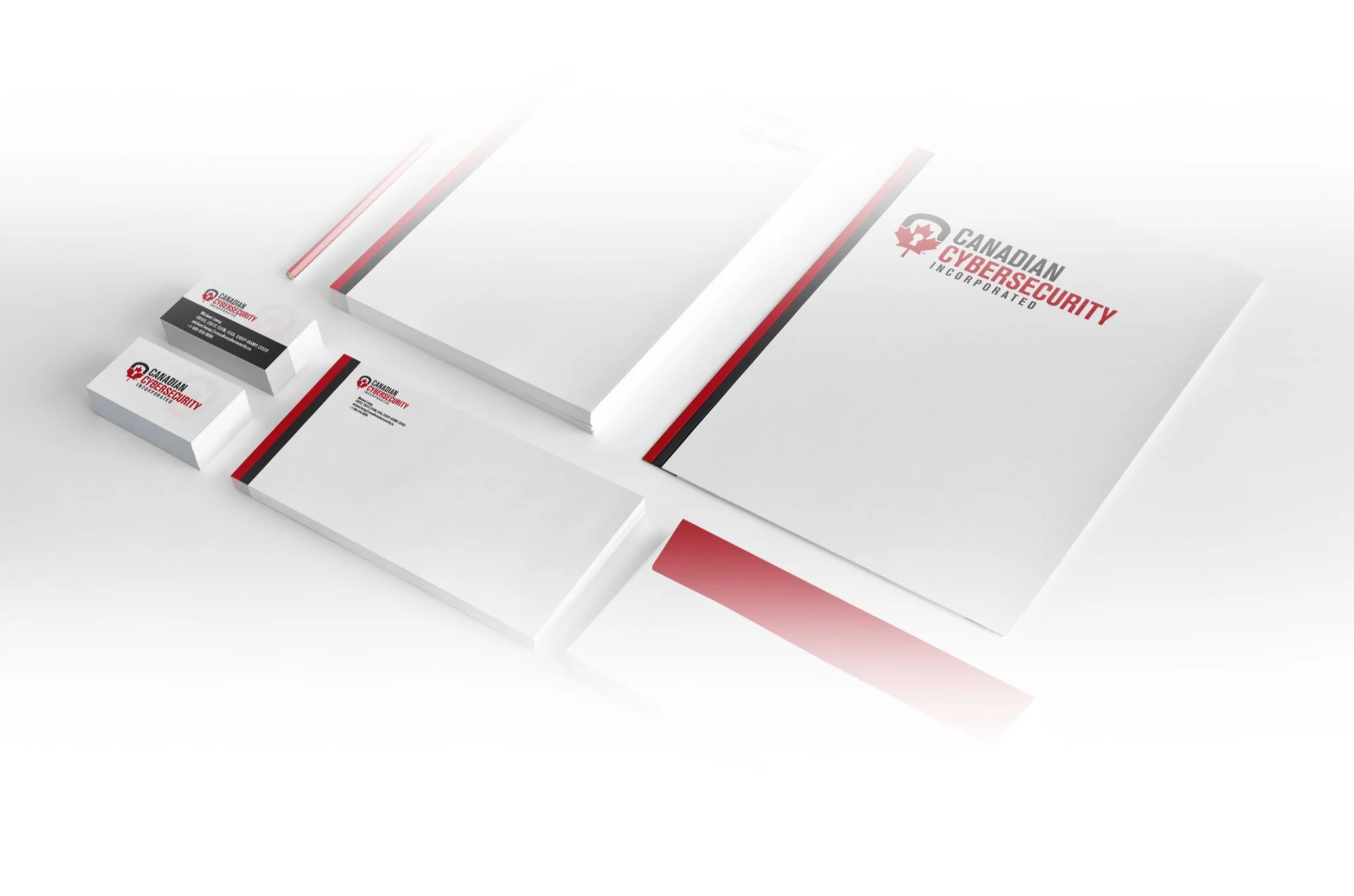
The stationery system — letterhead and envelope — carries the same discipline into documents. Proposals and reports from CCI arrive in packaging that matches what the firm charges for its work.
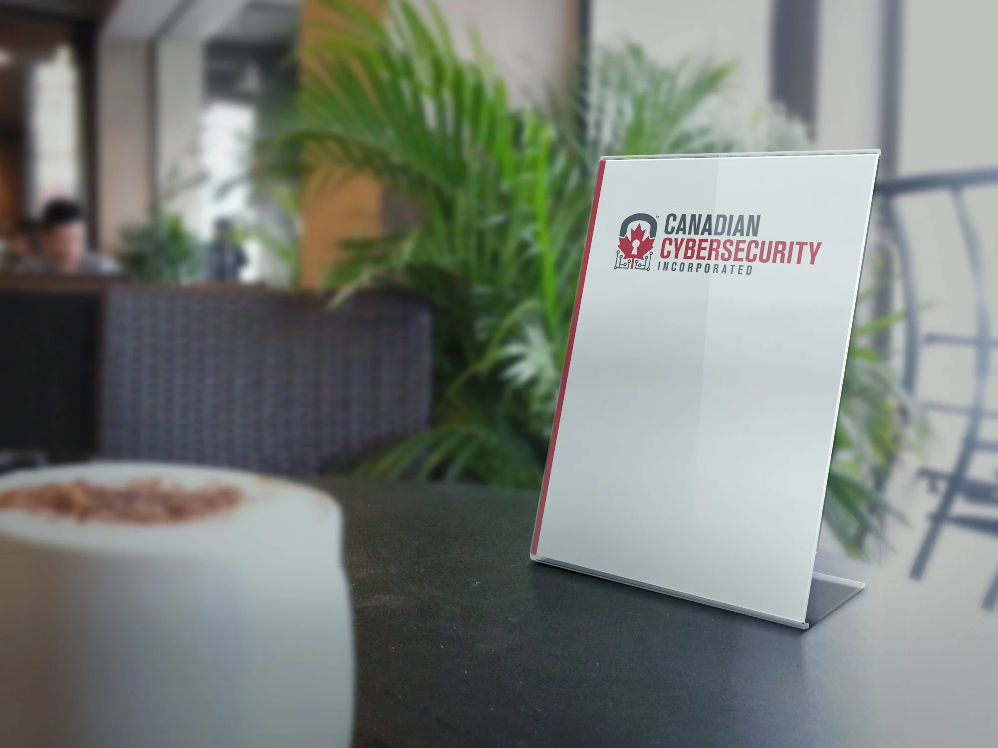
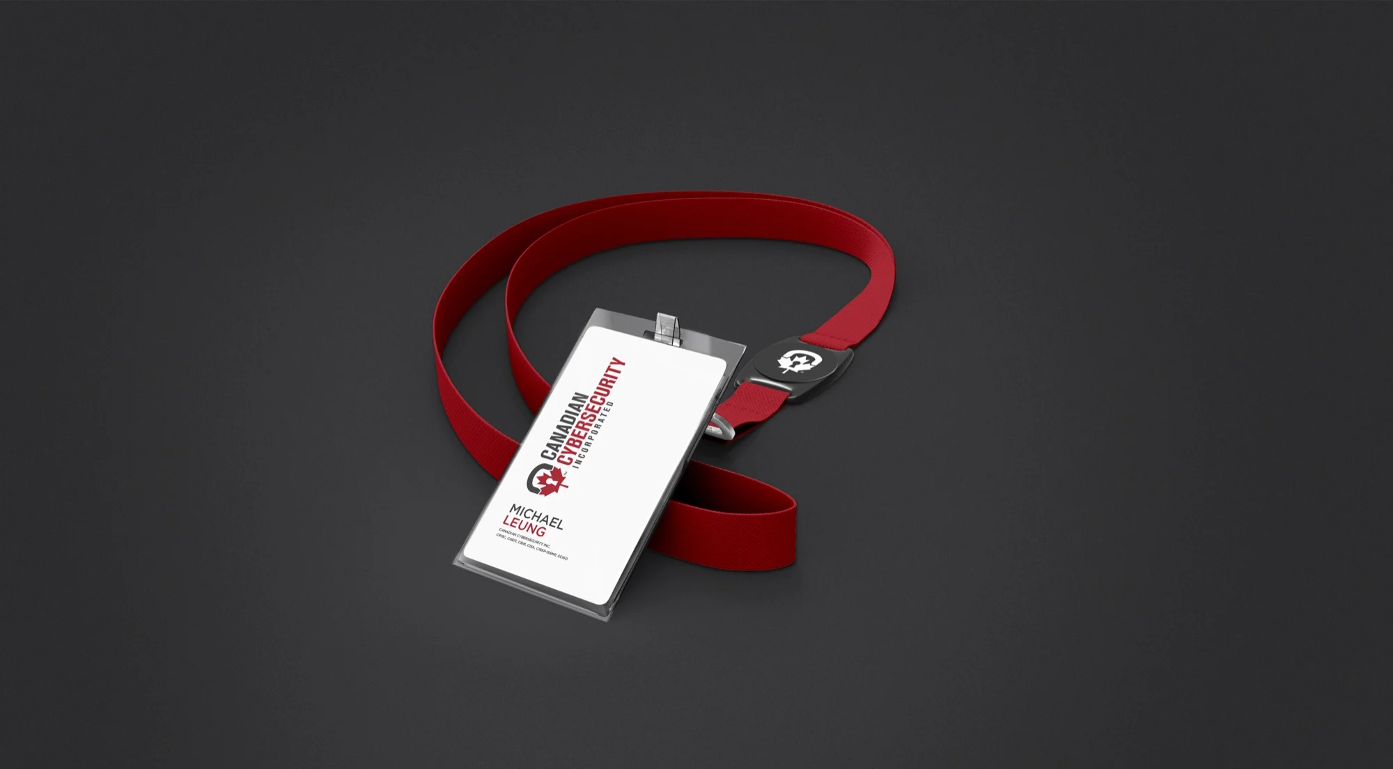
Conference and event materials: a table tent for tabletop presence, and a lanyard that puts the brand on every credential badge at every security industry event CCI attends. A credential holder is a moving touchpoint. The mark holds its own at badge scale.
At Scale

Vehicle branding scales the mark to door panels. What reads on a business card reads from across a parking lot.
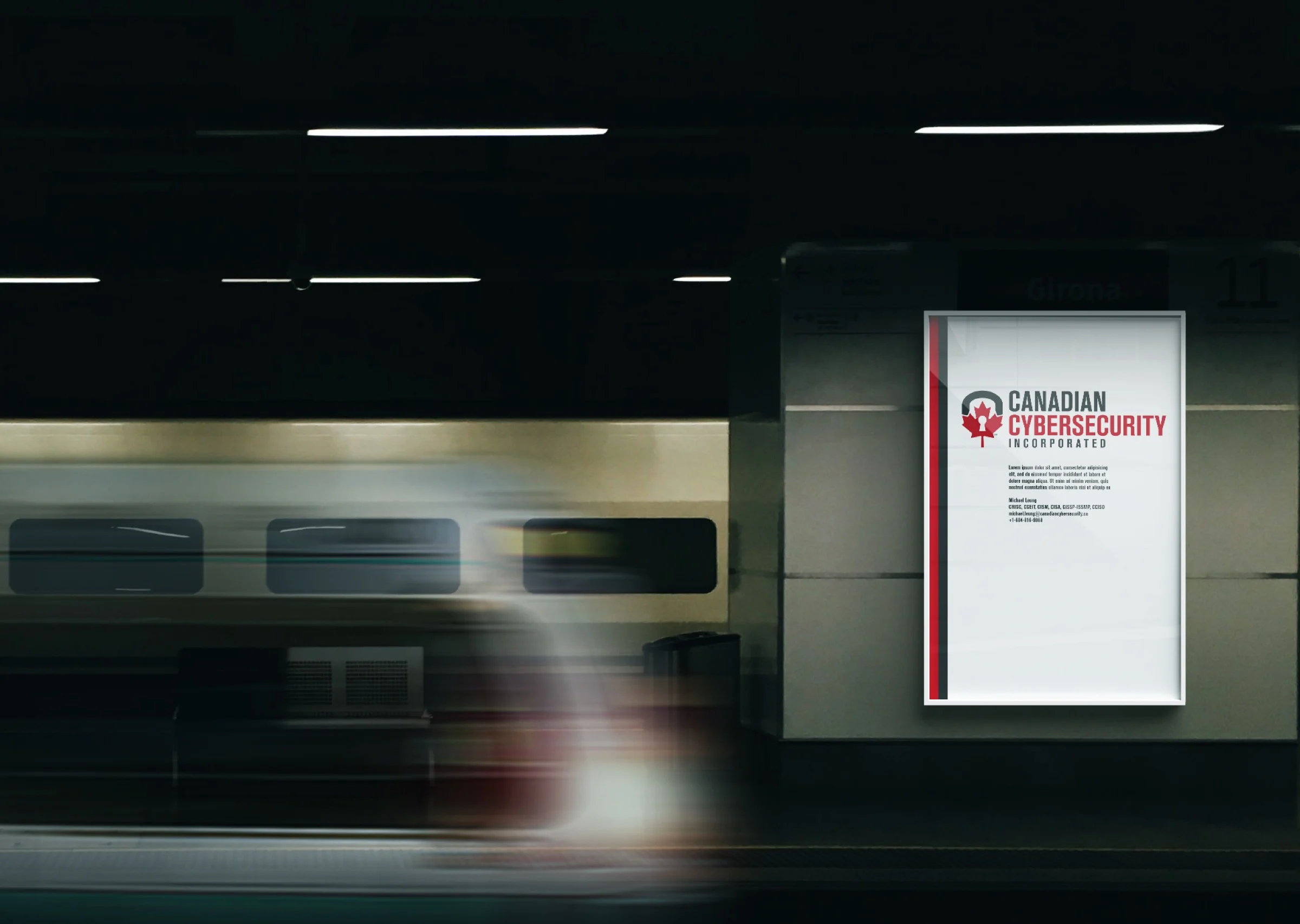
The subway poster is a real test: a commuter gives it less than three seconds. The CCI mark passes. The logo holds the composition at poster scale, and the visual language communicates technology authority without requiring a single word to be read.
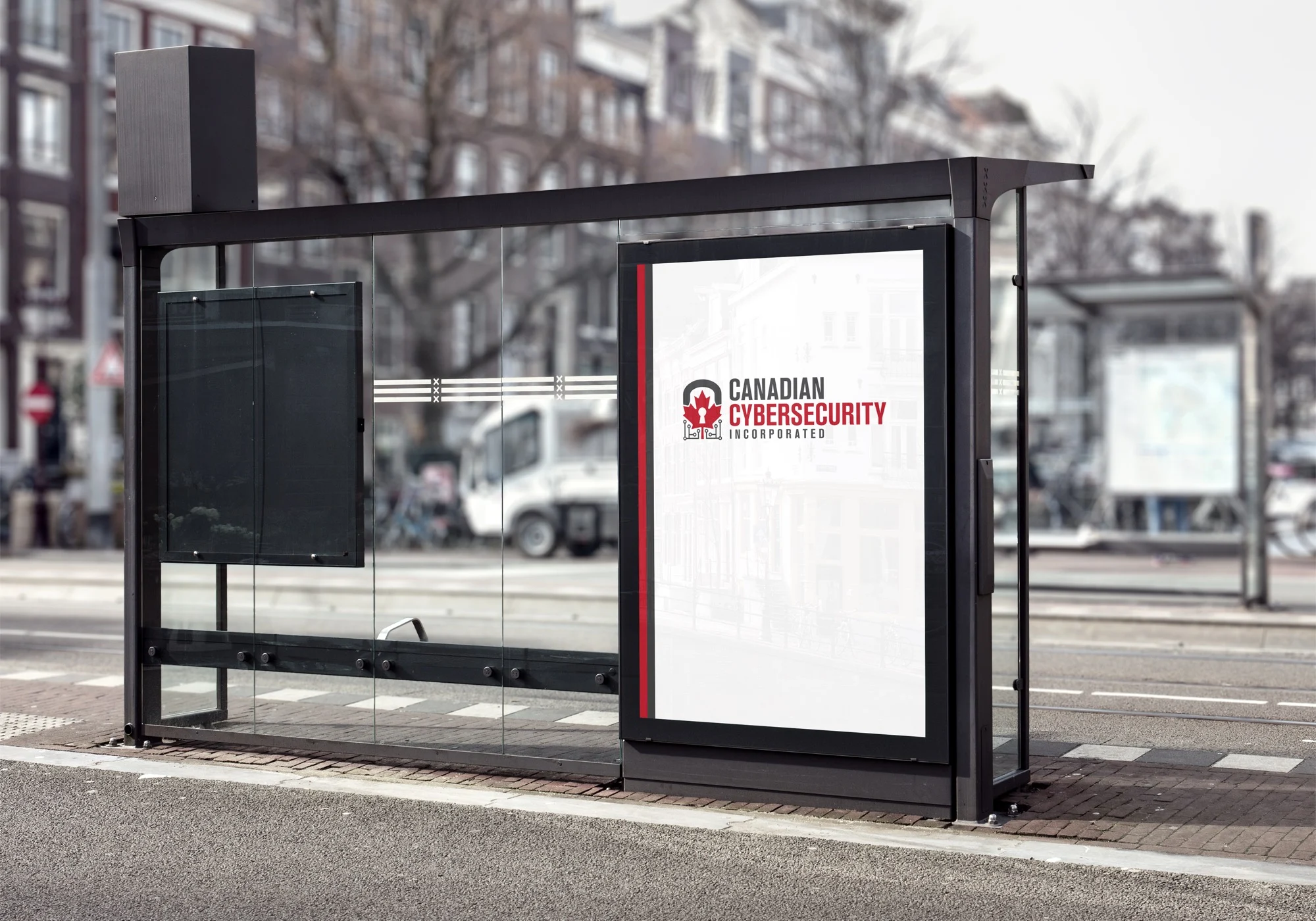
The transit shelter takes it further. Billboard scale, public exposure, the brand sharing space with every advertisement within sight. The padlock-maple-leaf-circuit mark earns its place at every size it’s asked to fill — from a browser favicon to a forty-foot shelter panel.
The Website
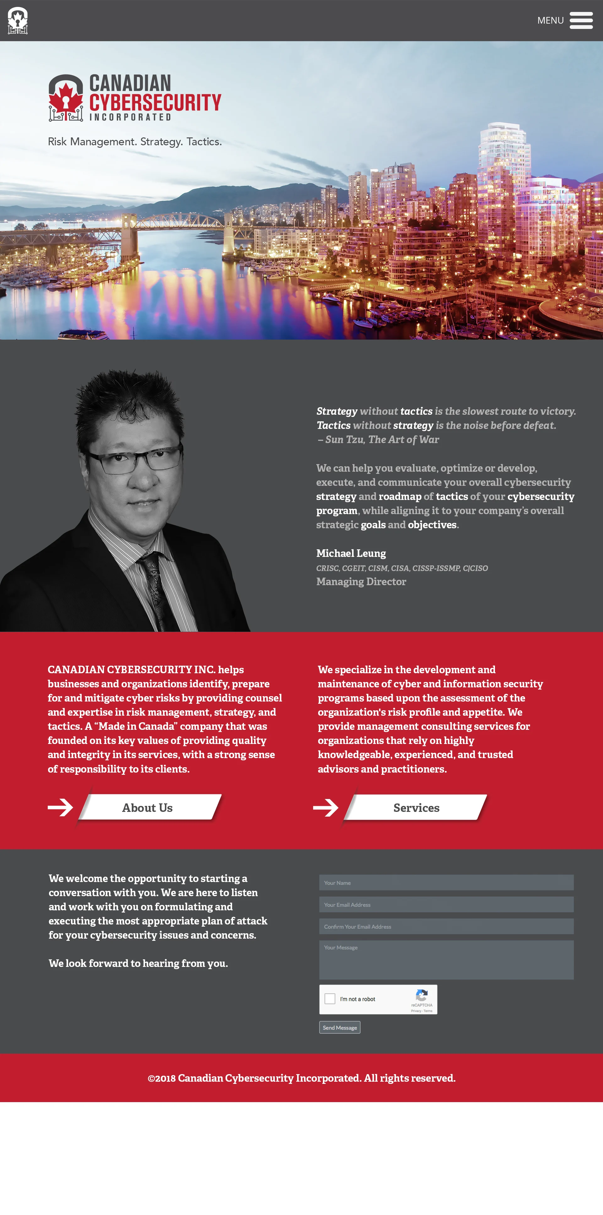
The website was designed across six page templates — home, services, about, strategic partnerships, thinking and innovation, and code of ethics — built to position CCI as a thought leader rather than just a service vendor. The visual discipline of the mark carries into editorial layout: structured, readable, authoritative.
The code of ethics page is worth noting. Most firms in this space don’t lead with one. Designing that page with the same visual weight as the services page tells prospective clients something about how CCI approaches its work before they’ve read a line of copy.
The Result
Canadian Cybersecurity Inc has a brand that moves with the firm — from the lanyard at a security conference to the bus shelter on a busy street corner.
The padlock-maple-leaf-circuit mark is legible to anyone in the industry and to any Canadian business evaluating who to trust with its digital security. It doesn’t look like every other cybersecurity brand. And it holds up at every scale CCI will ever need — a mark that does the same job the firm does: keeps the right things protected, at every size, without fail.